✨ Executive Summary
AutumnCare is a clinical management platform redesigned to streamline healthcare workflows, reduce administrative burden, and better support fast-paced, real-world care environments. Through extensive field research, MVP testing, and continuous iteration, I transformed a dated, desktop-reliant system into a mobile-first, user-centred experience.
- Role: Lead Product Designer.
- Team: PM, Developers, QA, plus stakeholders from Sales and Clinical Operations.
- Timeline: 12 months.
- Challenge: Redesign a feature-rich but inefficient platform to align with real-world workflows, reduce error rates, and support on-the-go care staff.
- Approach: Conducted field research in care homes, developed an MVP based on direct user observations, led multiple rounds of usability testing, and iteratively refined navigation, workflows, and accessibility.
- Outcome: A mobile-first redesign that significantly improved efficiency, usability, and user confidence — modernising a critical healthcare tool for everyday use.
- Key Results:
- 15% reduction in user errors
- 25% increase in task completion rates
- 35% boost in user confidence
Core Skills Applied
UX research • Interaction design • Usability testing • Accessibility
Introduction
AutumnCare is a clinical management platform trusted across the healthcare industry to streamline workflows and enhance team communication. However, years of UX neglect had led to growing frustration, inefficient workarounds, and critical workflow gaps. A cumbersome, desktop-only experience no longer supported the fast-paced realities of care work — and a full redesign was no longer just an improvement; it was a necessity.
The Problem: A Disconnect Between Product and Practice
Despite its rich features, AutumnCare suffered from significant usability issues:
- Cumbersome navigation made essential tasks frustratingly slow.
- A steep learning curve increased training costs and resistance among users.
- Desktop-only workflows forced staff to rely on handwritten notes instead of real-time updates.
These problems highlighted a fundamental misalignment between the software’s design and the day-to-day demands of care teams.
Research: Observing Real-World Care Workflows
To bridge this gap, we conducted on-site field research across multiple care homes. Shadowing nurses and carers revealed that most staff relied heavily on paper-based documentation — not by choice, but because the system was too impractical to use on the move. Desks were covered in sticky notes, and vital information often lagged behind. These real-world observations made it clear: AutumnCare’s workflows had to be reimagined for mobile-first, on-the-go use.
Key Insights: What Mattered Most to Users
Our research revealed three critical areas that shaped our design approach:
- Feature Priorities: Progress notes, medication tracking, care plans, handover, charts, and resident profiles were integral to daily operations.
- Workflow Preferences: Some users preferred a resident-first workflow, while others needed a task-first approach.
- Device Experience: Care staff needed a mobile-first design. Returning to a desktop after each task was inefficient, forcing them to rely on handwritten notes.
These insights were pivotal. Rather than redesigning the desktop application, we realized the platform needed a fundamental shift to a mobile-first design to align with real-world workflows.
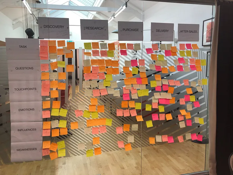
Visualizing the Problem: The Customer Journey Map
Back at the office, I thought it would be valuable to create a customer journey map with the wider team to visualize our brand experience and understand the impact of these usability issues. This was a nice break from the screen, and the visualization made the challenges tangible and reinforced the need for a user-centered redesign.
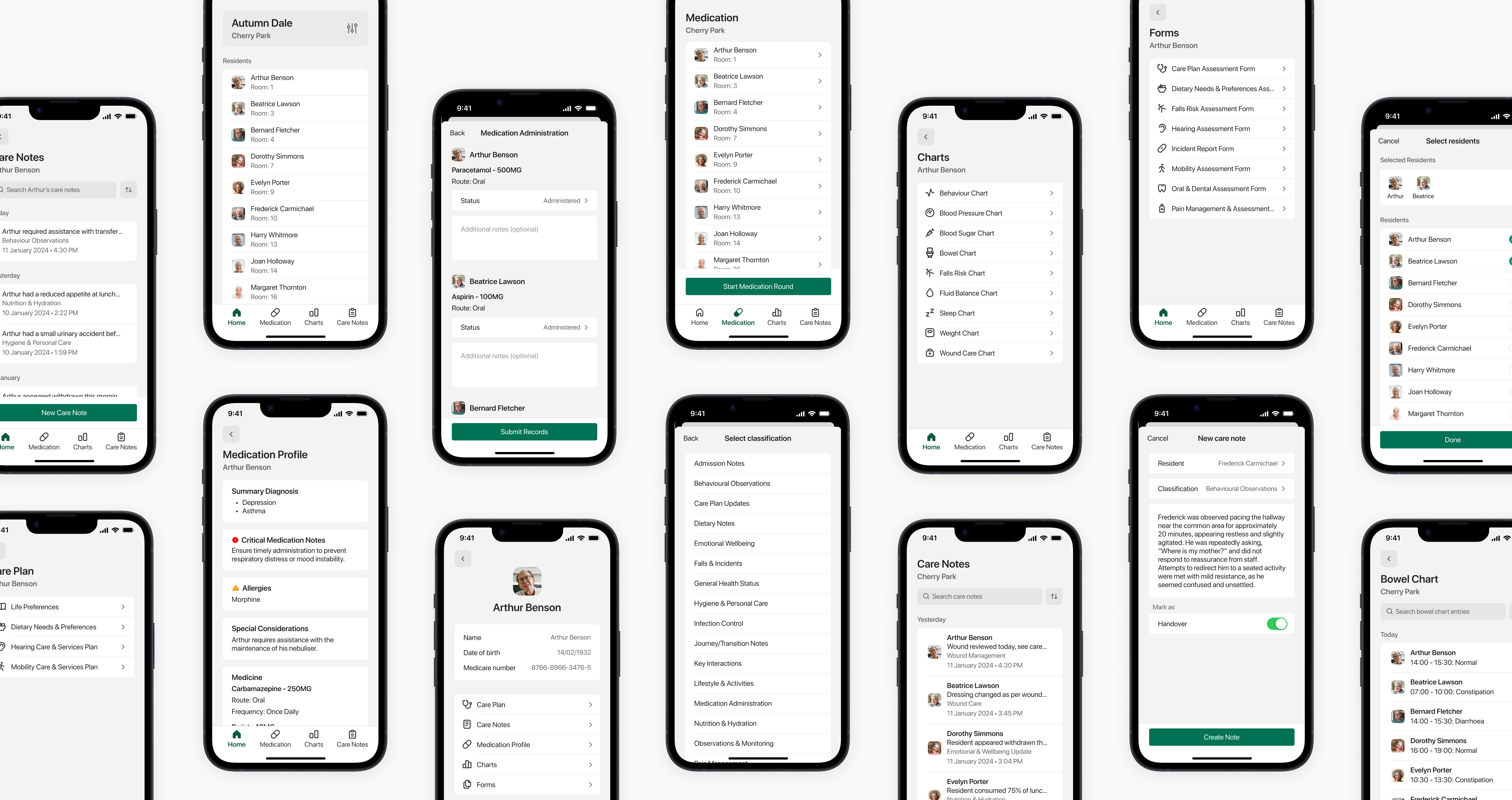
MVP: Turning Research into Action
Our field research answered most of our key questions. Interviews clarified the most important features, while workflow observations directed how we structured the platform’s information architecture (IA). These insights enabled us to build a Minimum Viable Product (MVP) to validate our approach before committing to a full-scale redesign.
Key MVP Design Decisions
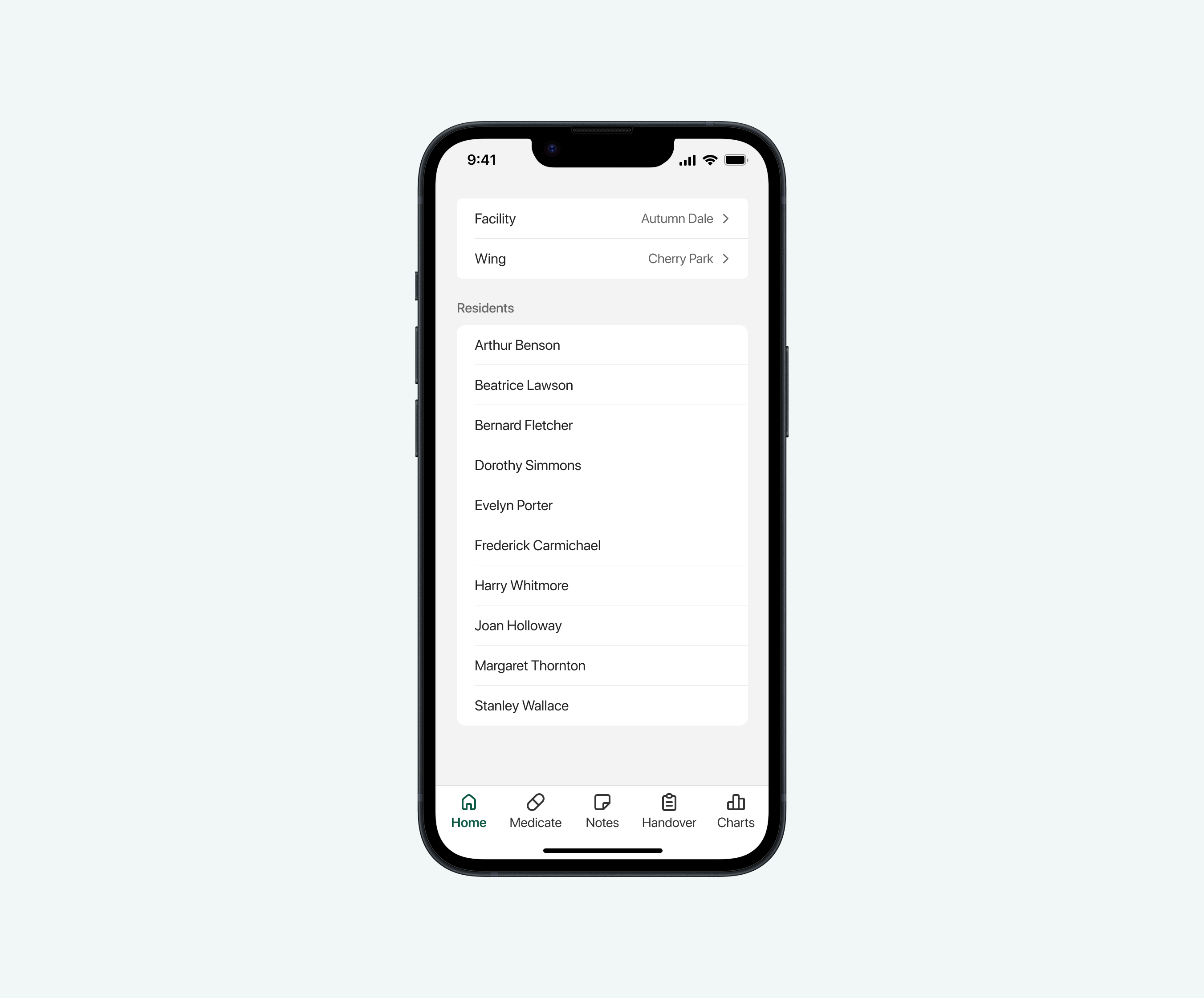
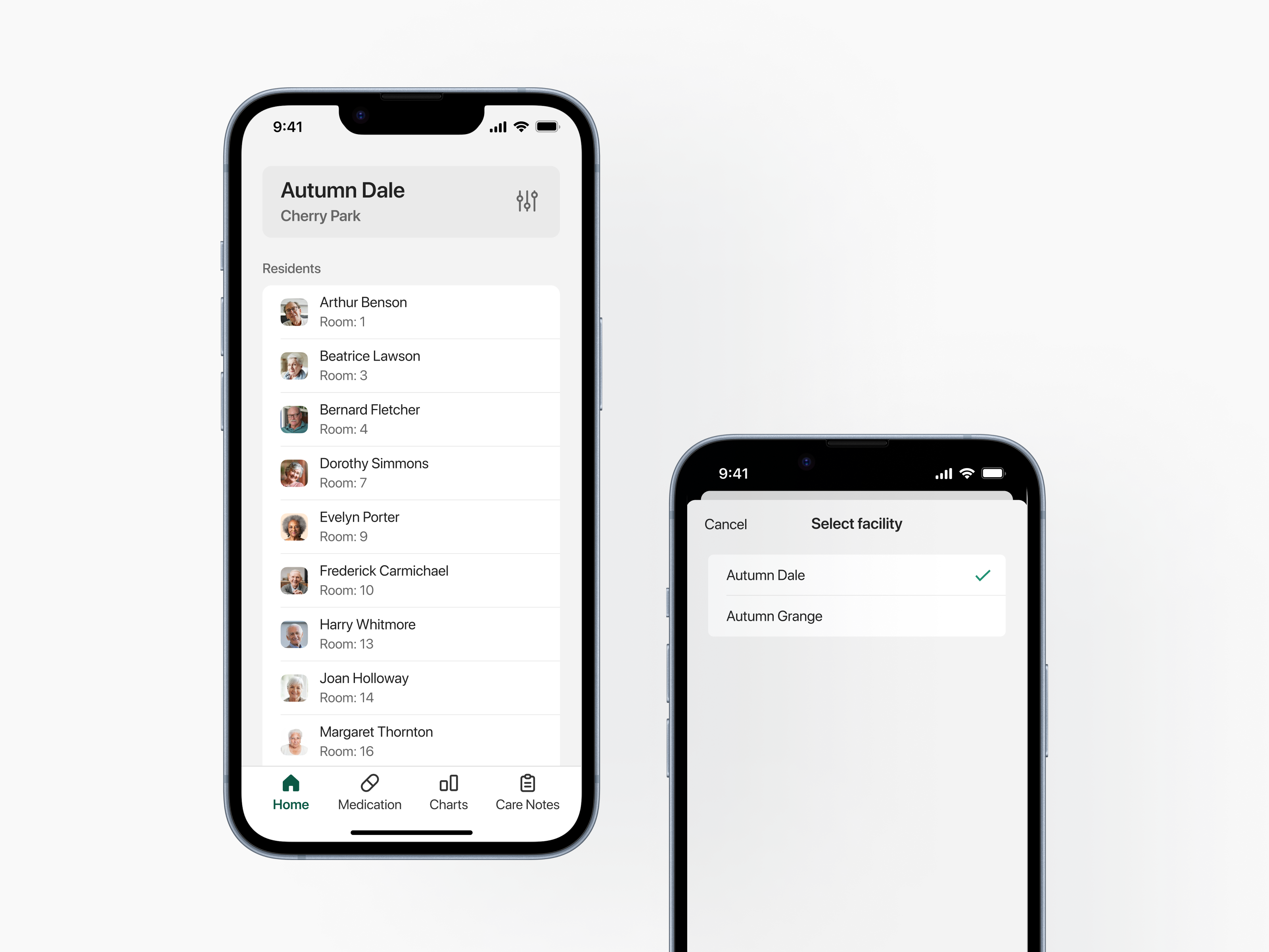
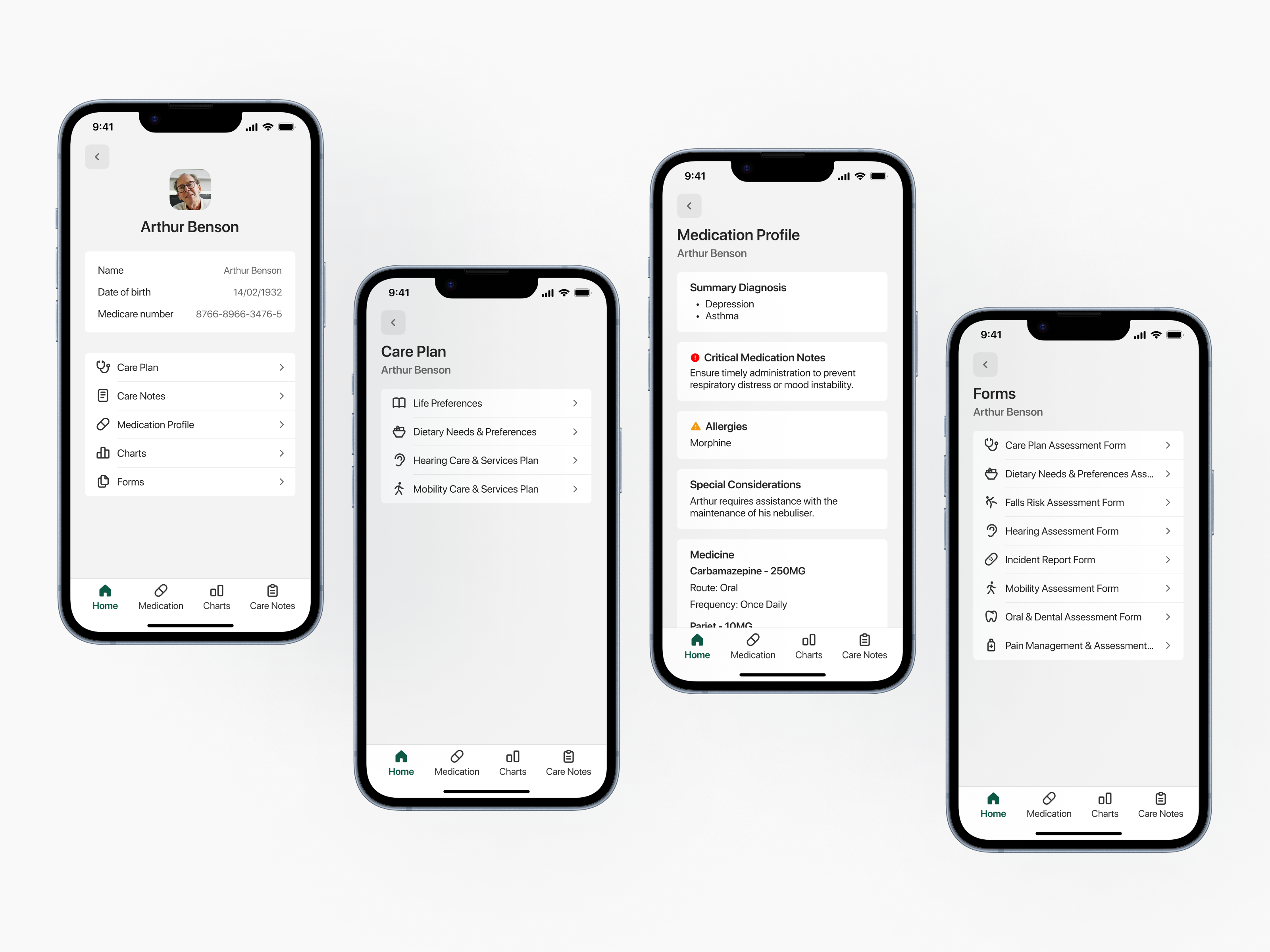
Flexible Workflows: A tailored home screen that provides direct access to residents, so that users can choose between resident-first and action-first workflows.
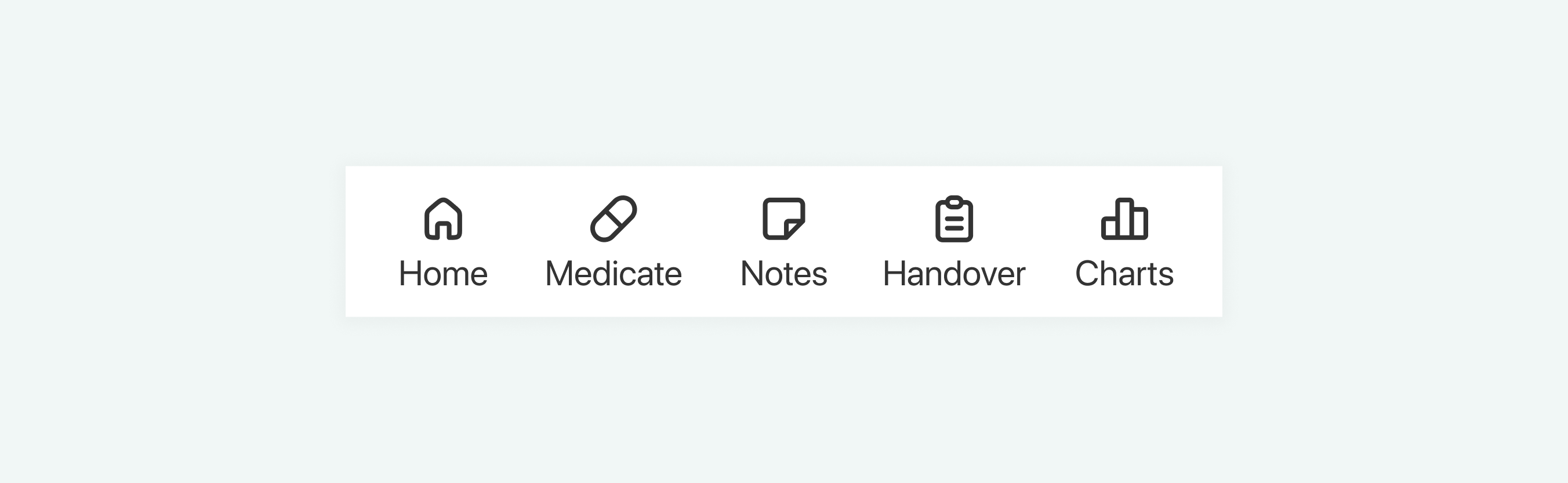
Navigation Overhaul: We implemented a simplified tab-based menu for easier access to key features.
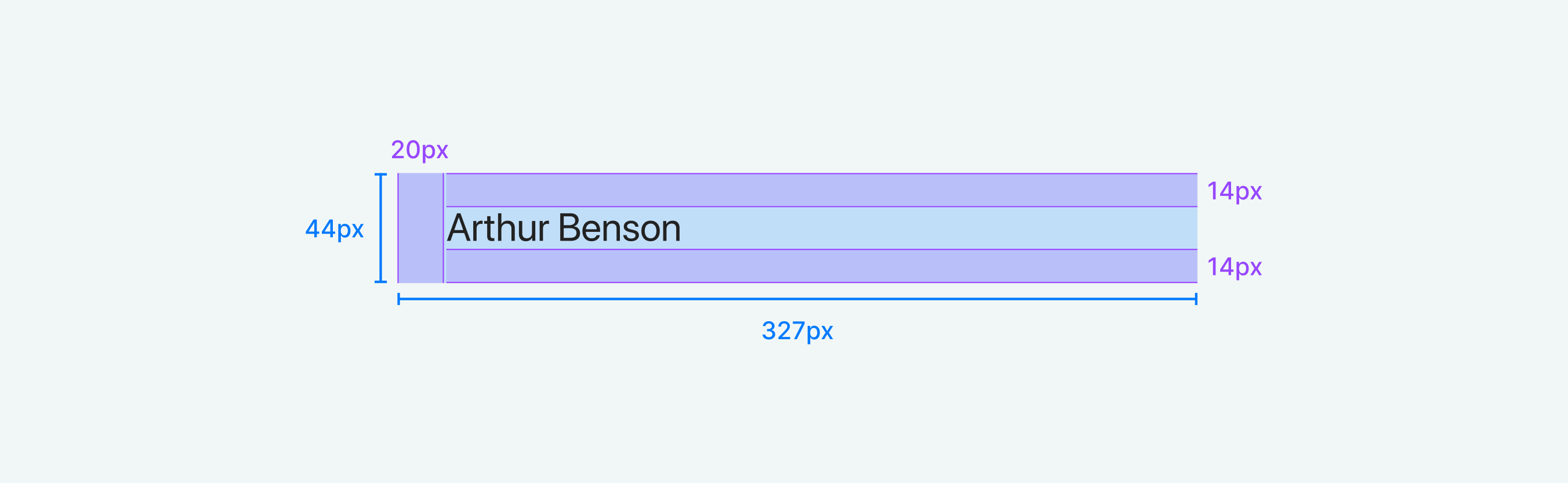
Mobile-Optimized Interactions: We applied Fitts's Law and optimal touch target size research to design touch-first components, ensuring quick and accurate selection with a minimum target size of 1cm × 1cm.
Usability Testing: Uncovering the Next Layer of Issues
Once we had a working MVP, we conducted usability testing with care staff to:
- Identify friction points before full-scale development.
- Iterate based on real user feedback, rather than assumptions.
- Ensure the redesign addressed users’ biggest frustrations.
Pain Points & Opportunities
While our field research set a strong foundation, testing revealed additional usability gaps that needed to be addressed:
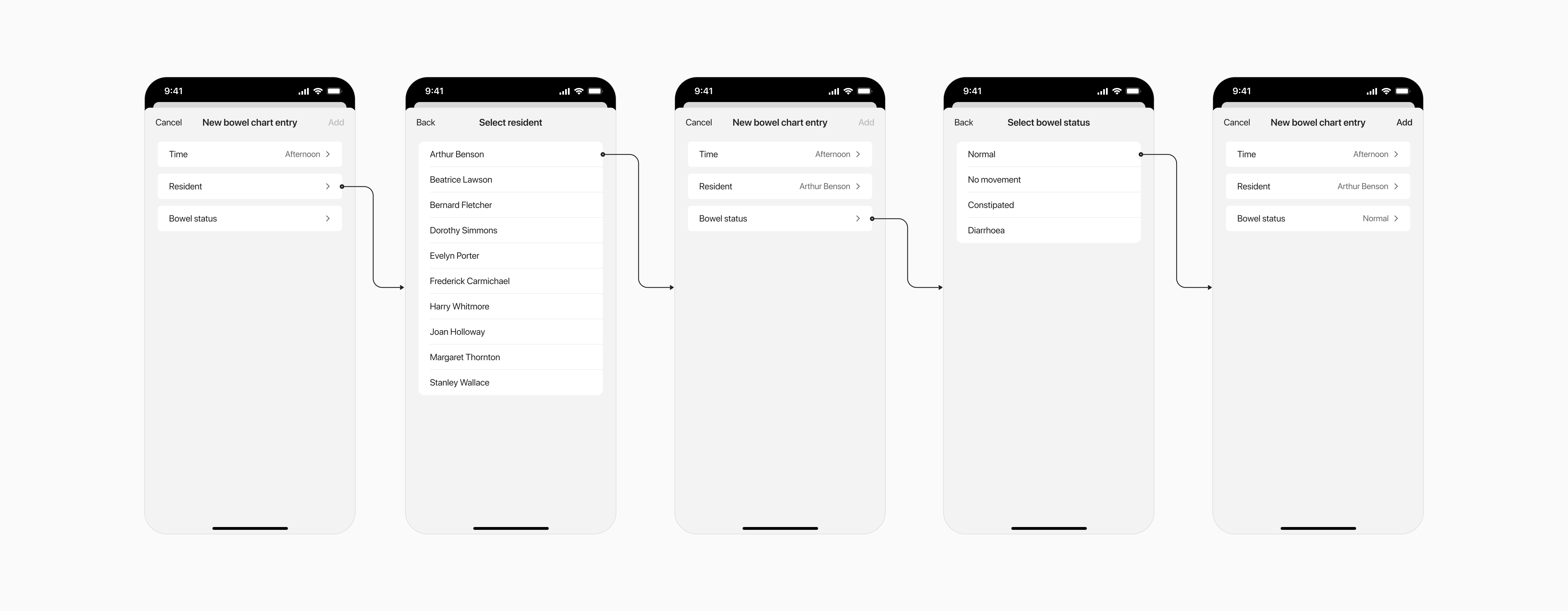
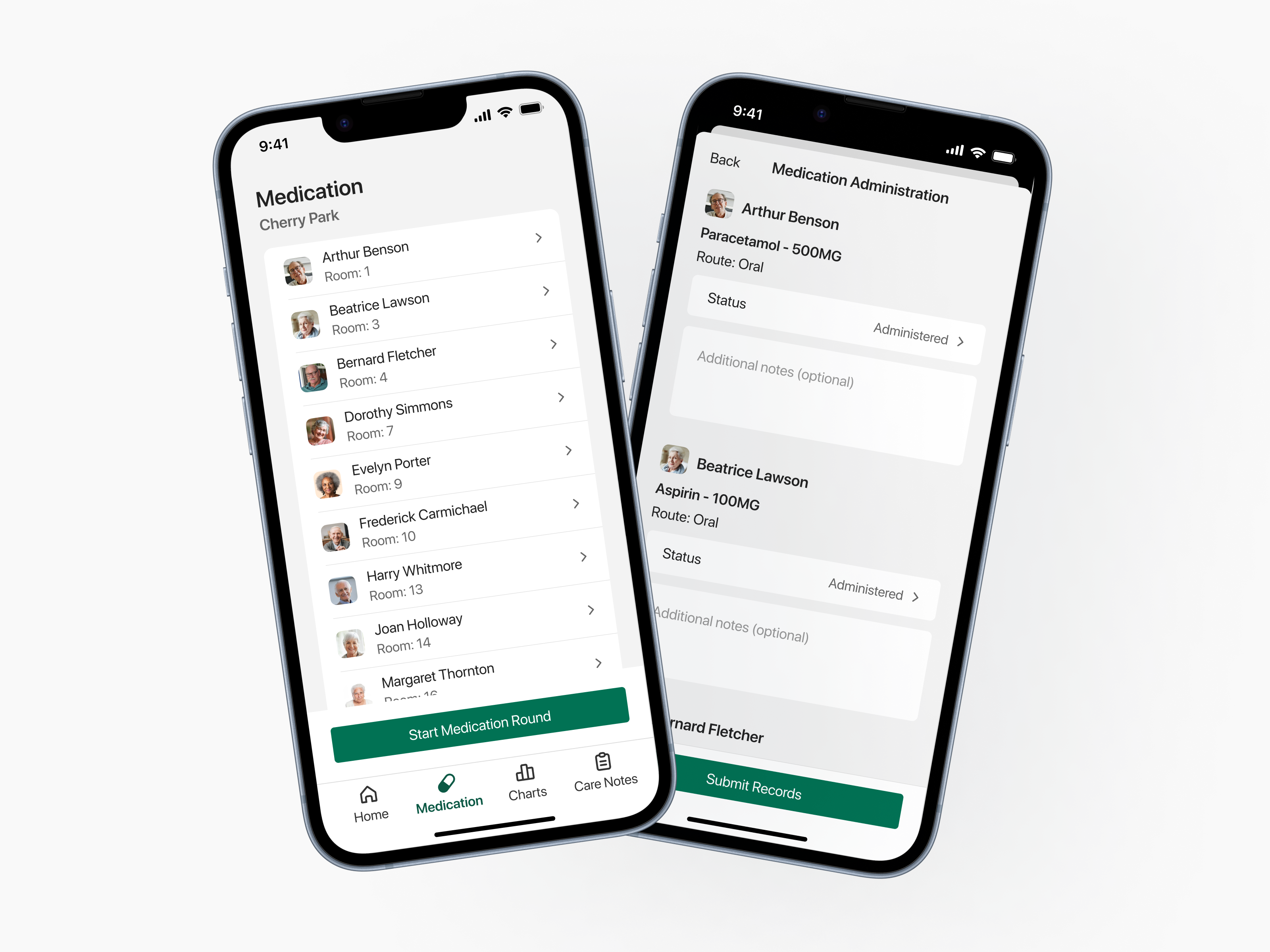
- Bulk Data Entry: Users needed to enter information for multiple residents, but the system only allowed individual entries. This quickly became repetitive and impractical, highlighting the need for bulk entry capabilities.
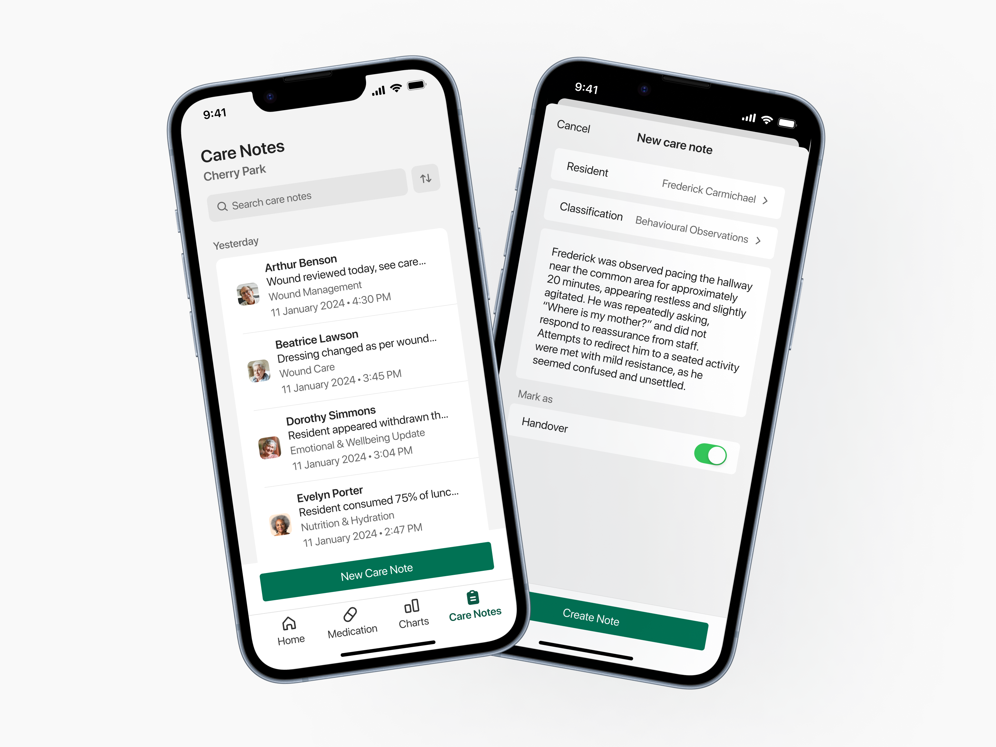
- Navigation & Cognitive Load: When asked to create a handover note, some participants instinctively navigated to the Notes tab instead of Handover. After completing the action, they weren’t sure if it had been saved, indicating a need for clearer information architecture and feedback mechanisms.
- Resident Identification Challenges: Staff reported difficulties distinguishing between residents with identical names, highlighting the need for photos and room numbers.
- Unclear Actions & Accessibility Issues: Action buttons were too subtle, lacked labels, and were awkwardly placed in the header, making them difficult to identify and reach.
Iterating on the MVP: Refining Based on Testing
We took these insights and refined the experience to better align with user needs:

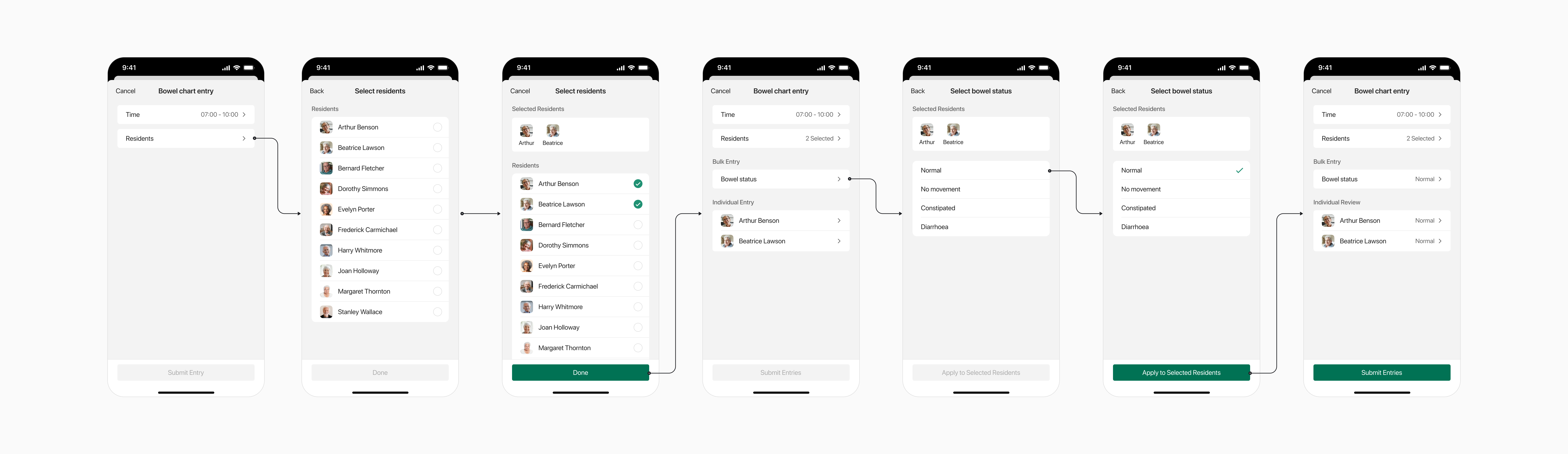
Resident Profile Enhancements: Photos and room numbers were added to resident profiles to help with identification.
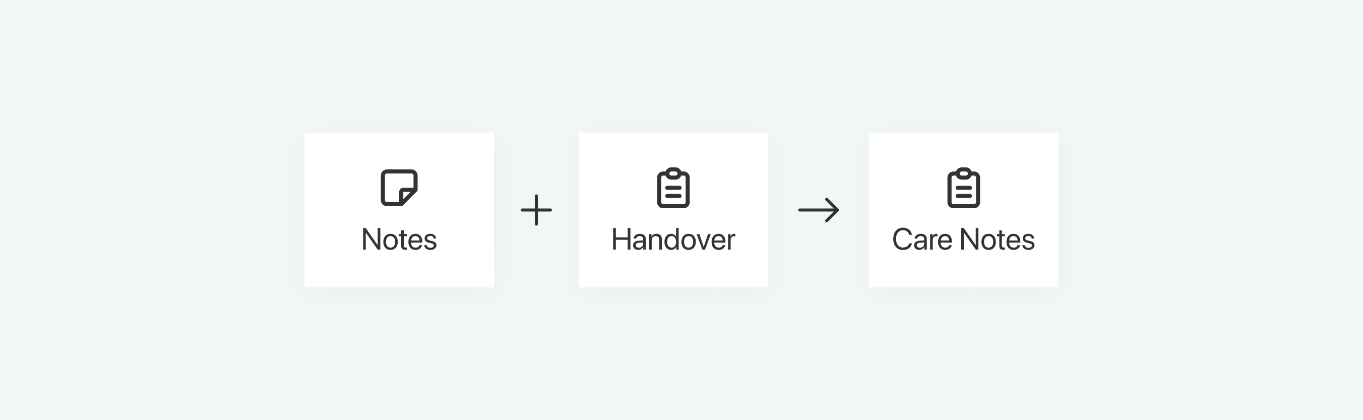
Streamlined Navigation & Information Architecture: The Handover and Notes sections were coalesced into one tab called ‘Care Notes’ for better discoverability.
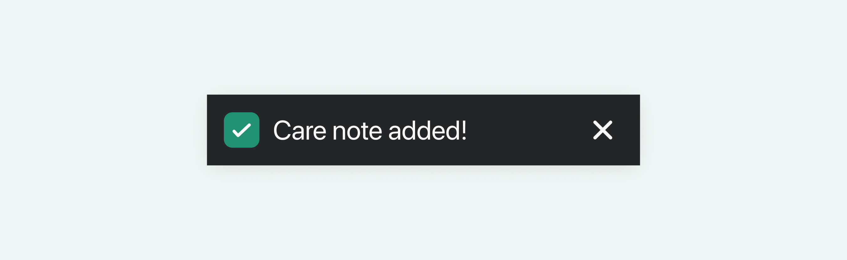
Immediate Feedback with Toast Messages: Users now receive confirmation when actions are completed, eliminating uncertainty.

Action Button Improvements: Buttons were repositioned, labeled with clear action-driven text (verb + noun), and made more accessible for mobile users.
Bulk Entry Support: We introduced batch data entry for medication and charts to match real-world workflows.
Before:
After:
Results
With these improvements, our next round of usability testing revealed:
- 15% fewer errors
- 25% increase in task completion rates
- 35% boost in user confidence
This was more like it! We were now on track to delivering a more efficient, seamless, and frustration-free UX. 🎉
Final Refinements: Polishing the Experience
Despite these improvements, some users still struggled to identify which tab or feature they were viewing confidently. To address this, we:
Redesigned the page headers to make titles more prominent.
Filled the active tab’s icon to reinforce the user’s location within the platform.
Once this final issue was addressed, all major usability concerns had been resolved. With the core functionality and a clearer visual hierarchy in place, we shifted focus to enhancing the visual design:
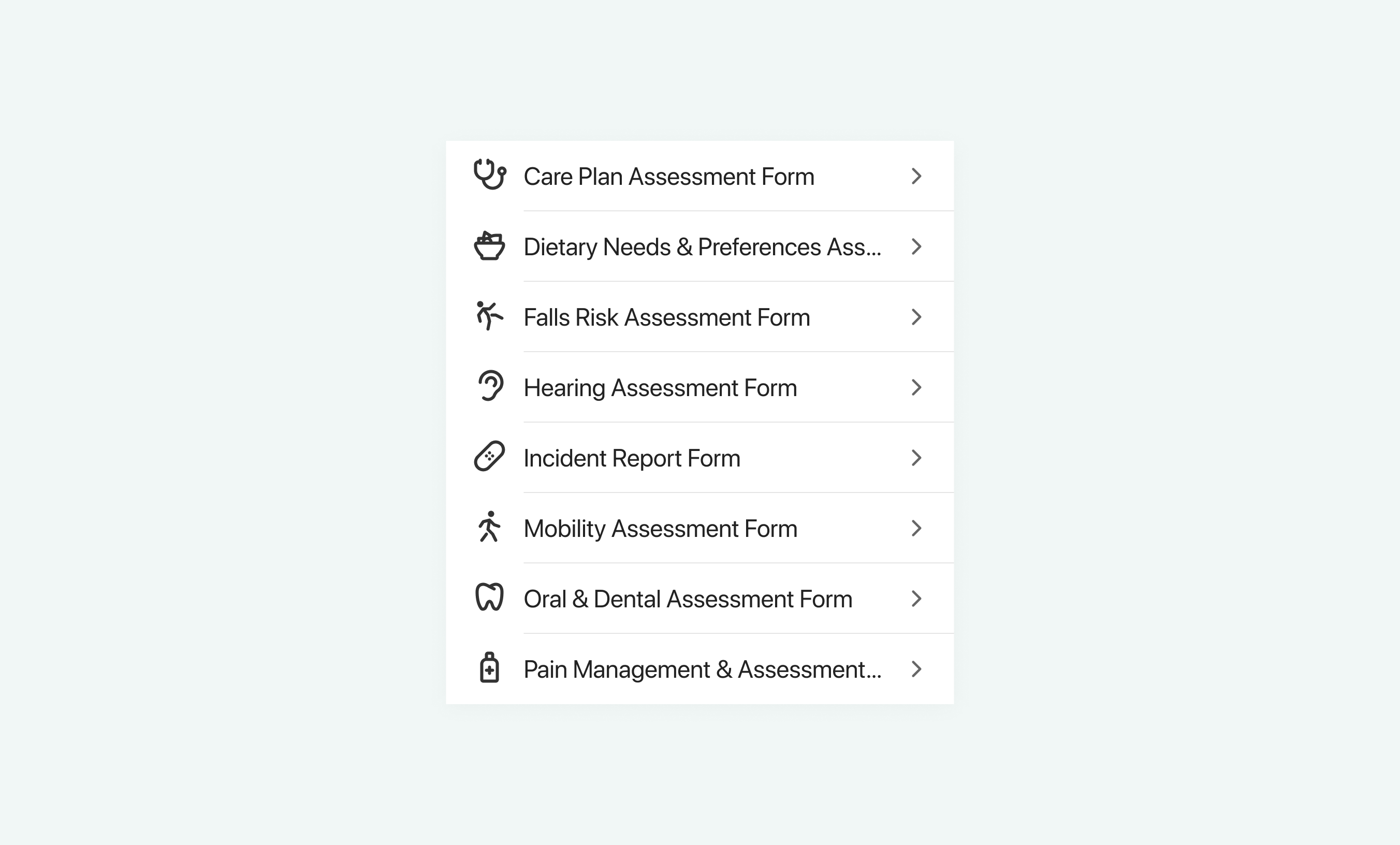
I introduced icons as visual shorthands, reducing cognitive load and adding personality to the app.
Accessibility Compliance
How we embedded accessibility into the AutumnCare platform to ensure a more inclusive and user-friendly experience:
- Screen Reader Considerations: Interactive elements have clear, descriptive labels.
- Colour & Contrast Use: Maintained a minimum contrast ratio of 4.5:1 for text and 3:1 for UI components, verified with WebAIM.
- Text Scaling & Readability: Used REM units to support dynamic text scaling.
- Ample Touchpoints: Buttons, and other interactive elements, are designed to be at least 44x44px, ensuring easy tapping and clicking for all users.
Lessons Learned & Next Steps
Usability testing confirmed significant improvements in efficiency and user confidence. The redesign had successfully transformed a dated, cumbersome system into one that empowered and supported care staff.
However, UX is an ongoing process. Moving forward, continuous feedback from care teams will be essential to monitor real-world adoption, identify emerging pain points, and ensure the design continues to evolve with user needs.
Key Takeaways
- The Power of Field Research: Observing care staff revealed workflow challenges that wouldn’t have surfaced in interviews alone.
- Testing Early and Often Saves Resources: Building an MVP first allowed us to validate solutions before committing to full development.
- Clarity is Everything: Small refinements—like clearer headers, toast messages, and improved button visibility—had a significant impact on usability.
- Designing for Real-World Workflows Matters: Features that seemed functional in isolation, like individual chart entries, didn’t align with actual workflows. Introducing bulk data entry was a game-changer.
This project reinforced the importance of blending research, iteration, and usability testing, which was key to creating a truly useful product.