✨ Executive Summary
Pitchbooking is a platform that helps sports facility managers streamline bookings and payments — creating a smoother experience for both organizers and players.
- Role: Lead Product Designer.
- Team: PM, 3 Developers, 1 QA, and stakeholders from Sales.
- Timeline: 4 months.
- Challenge: Refresh an outdated platform UI while addressing deeper usability issues around navigation, booking flows, and mobile responsiveness.
- Approach: Partnered with customer support to gather real user feedback, analyzed session recordings to identify friction points, conducted market research into leading booking platforms, developed user personas, restructured information architecture, and created exploratory wireframes and user flows.
- Outcome: A user-centered redesign framework focused on simplifying bookings, improving mobile usability, modernizing the UI, and reducing user friction across the platform.
- Key Results:
- Identified and validated key usability pain points early
- Streamlined booking flows to reduce abandonment and introduced a new block booking feature to support complex reservation needs
- Modernized the platform’s visual and interaction design foundations
Core Skills Applied
UX research • UI design • User personas • Information Architecture • Wireframing
Introduction
Pitchbooking is all about making life easier for people managing sports facilities. Whether it’s a local football club, a community centre, or a large venue, the platform helps facility owners handle bookings and payments effortlessly — creating a smooth experience for both organizers and players.
Problem Identification
I was tasked with refreshing the platform’s UI to create a modern, user-friendly experience. But as I explored the product, it became clear that this would require more than just a fresh coat of paint; it called for a thoughtful, user-first approach. To move forward, I needed to understand the product from the user’s perspective.
User Research: Understanding Our Users
To get a clearer picture of user behaviour, I teamed up with Pitchbooking’s customer support team — their frontline insights into user frustrations were invaluable. We gathered real feedback from customers, dug into common support issues, and reviewed session recordings to see how people were interacting with the platform.
What We Discovered:
- Users abandoned bookings due to confusion.
- Navigation pain points were a top support request
- Users perceived the UI as outdated compared to competitors.
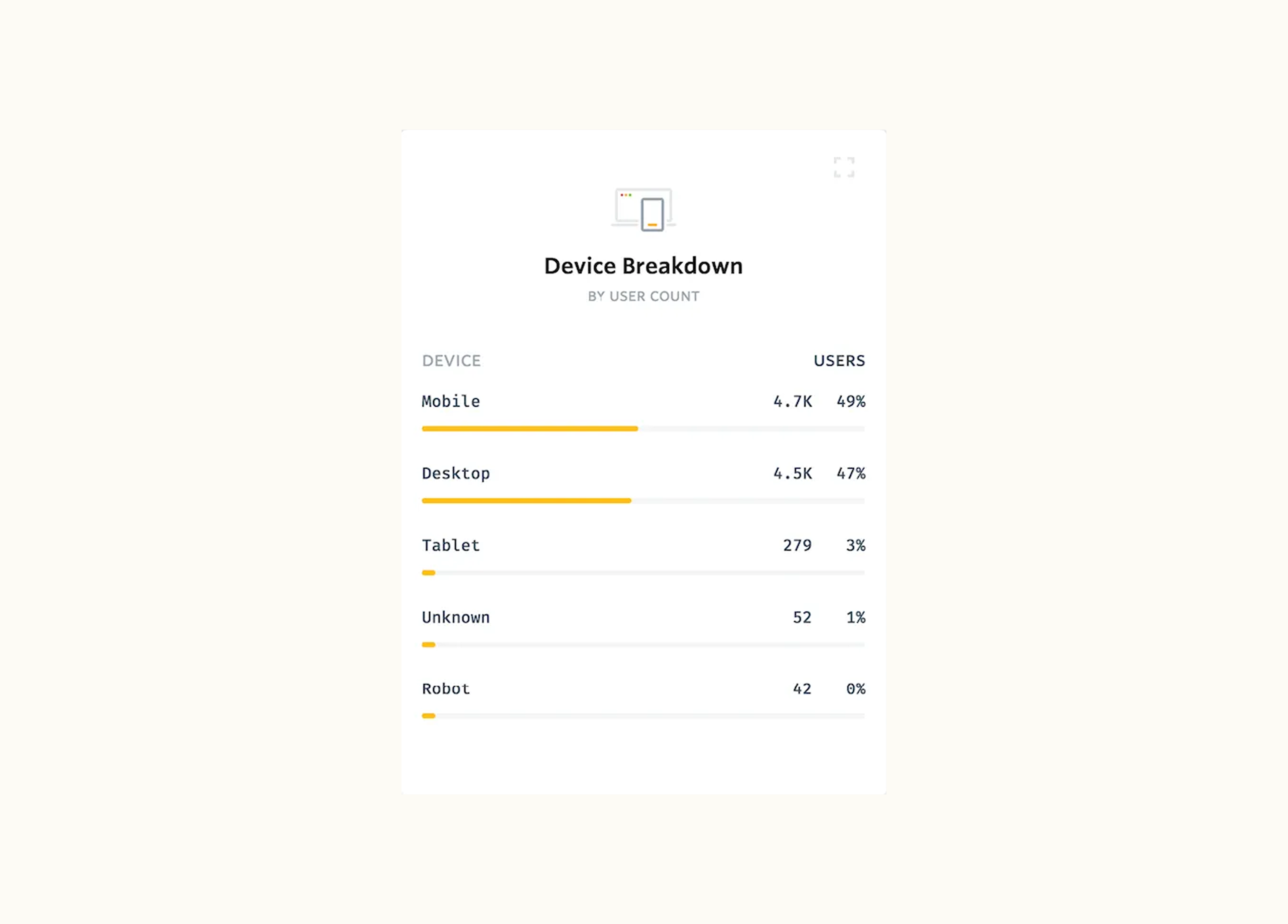
- Mobile UX was inconsistent — almost 50% of users accessed the platform on mobile, but the mobile experience felt like an afterthought.
These findings validated some early suspicions — and, in some cases, revealed issues we hadn’t anticipated.
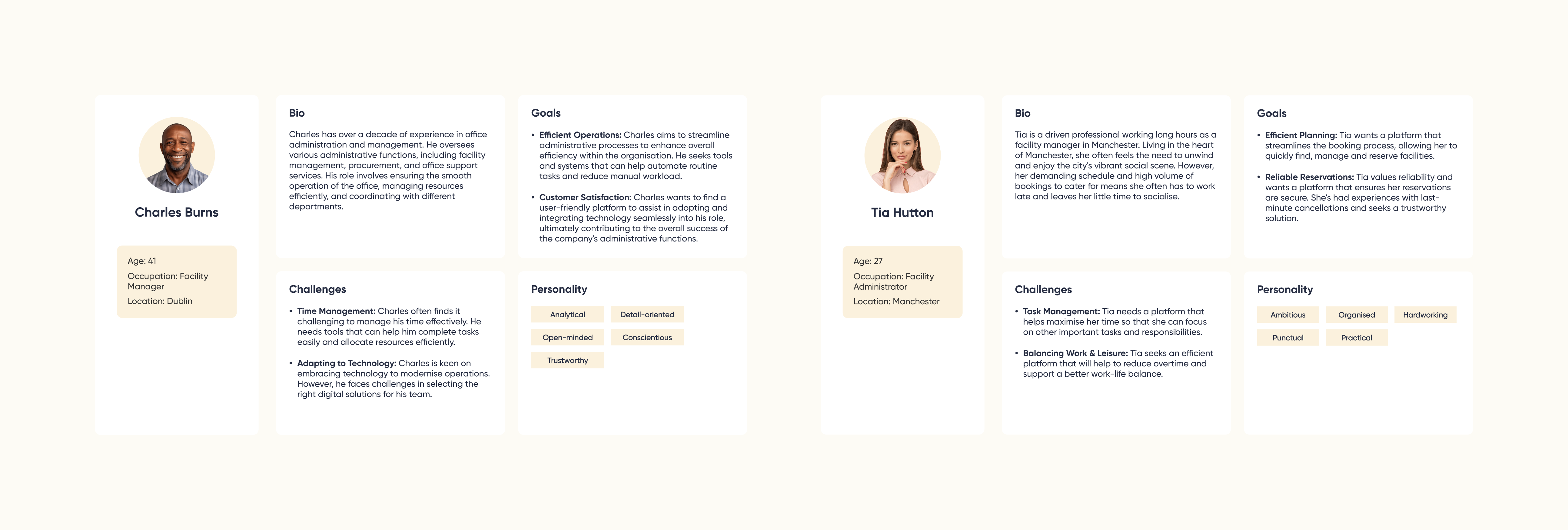
User Personas: Bringing Our Users to Life
To ensure the redesign was grounded in real user needs, I synthesized our research into a set of user personas that reflected the needs, frustrations, and behaviours of real Pitchbooking users. These personas became a core reference throughout the project—providing a clear understanding of who we were designing for, aligning the team, and guiding key UX decisions from early ideation through to validation.
UX Focus Areas
With clear personas and problem areas defined, I framed the key focus areas for the redesign:
- Modernise the UI to improve perception and usability
- Simplify booking flows and support use cases like block bookings
- Rethink navigation to reduce confusion and support discovery
- Optimize the mobile experience to ensure a seamless experience across devices
These objectives ensured the redesign addressed the root problems — not just surface-level styling.
Market Research: Learning from the Best
To gain a fresh perspective, I explored how leading platforms had approached similar challenges. Two obvious candidates were industry giants Booking.com and Airbnb — both widely considered gold standards for online reservations. So, I did what any good UX designer would do: I became a new user and walked through their booking experiences to understand what felt seamless, what didn’t, and which patterns could inform Pitchbooking’s redesign.

Key Takeaways:
- Clear onboarding: Communicating platform value upfront.
- Personalized recommendations: Enhancing user engagement.
- Intuitive search & filtering: Helping users find what they need quickly.
- Seamless booking process: Transparent pricing and clear steps.
- Strong visual hierarchy: Guiding users toward key actions effortlessly.
This external lens helped us challenge assumptions, adopt proven UX patterns, and elevate the overall quality of the platform.
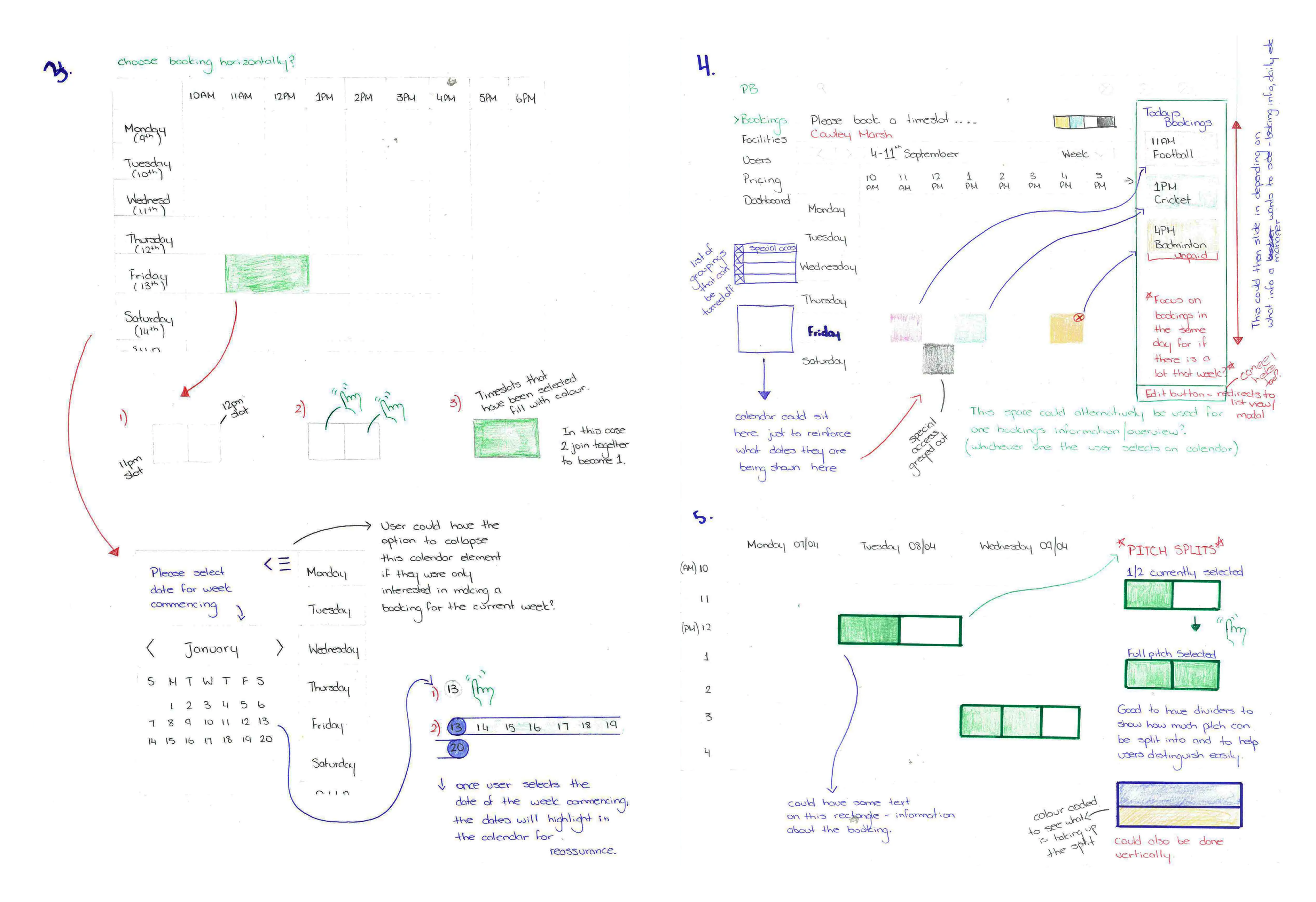
Ideation & Sketching
Guided by research insights, I sketched initial UI concepts to explore interaction patterns, content structures, and visual hierarchy improvements.

Bitesize UX: The Power of Sketching
In my second year of Interaction Design studies, a sketching workshop completely reshaped how I approach design. We learned to quickly map out interfaces, layouts, dynamic elements, and user interactions—unlocking a rapid, low-risk way to explore ideas before diving into high-fidelity mockups.
Since then, sketching has become a staple in my UX process, helping me iterate, test layouts, and think through user flows in a natural, flexible way. Check out some of my exploratory sketches below — they’re intentionally rough to encourage flexible ideation, and that’s the beauty of it! If you can visualize the idea, you’re on the right track.
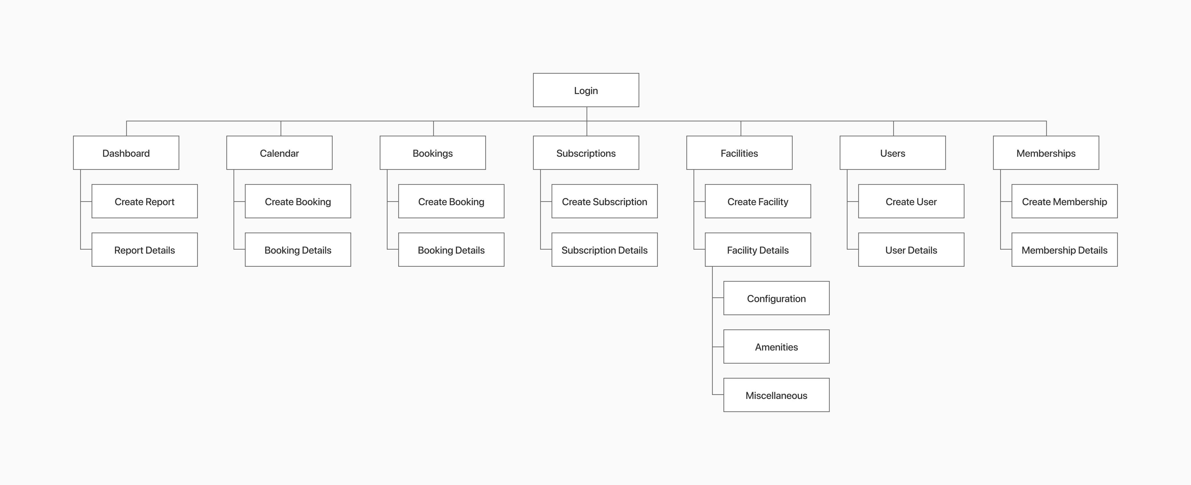
Information Architecture Exploration
One of the biggest frustrations we uncovered was how difficult it was for users to find what they needed. Key features were buried in unexpected places, and the navigation didn’t always follow a clear logic. To tackle this, I proposed revisions to the platform’s information architecture — creating a more intuitive, user-friendly flow that made sense for both new and returning users.
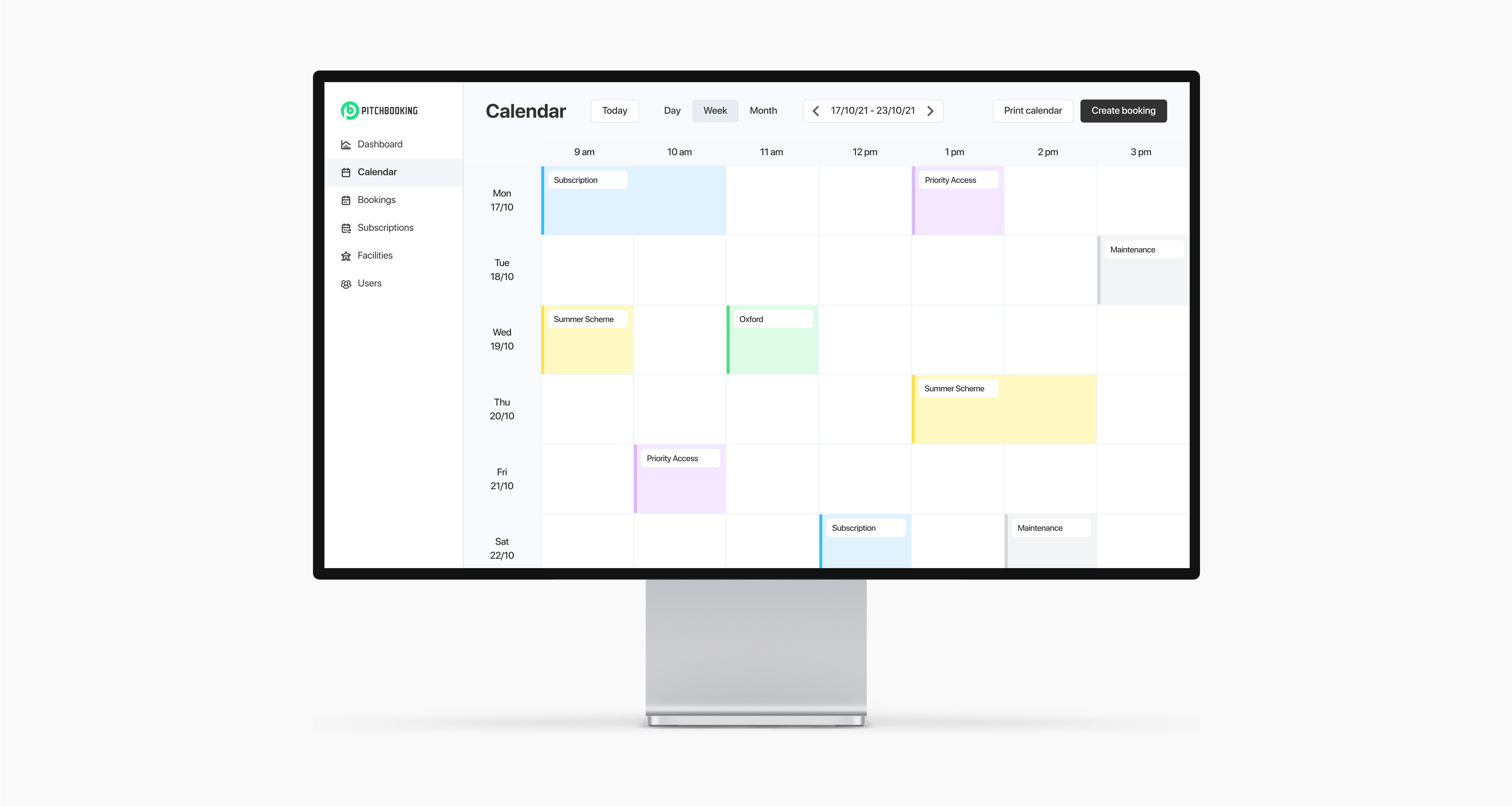
Wireframes & User Flows
I translated early concepts into greybox wireframes, facilitating stakeholder discussions and internal collaboration. These wireframes provided a visual representation of the platform, ensured a user-centric approach and highlighted early-stage usability considerations.
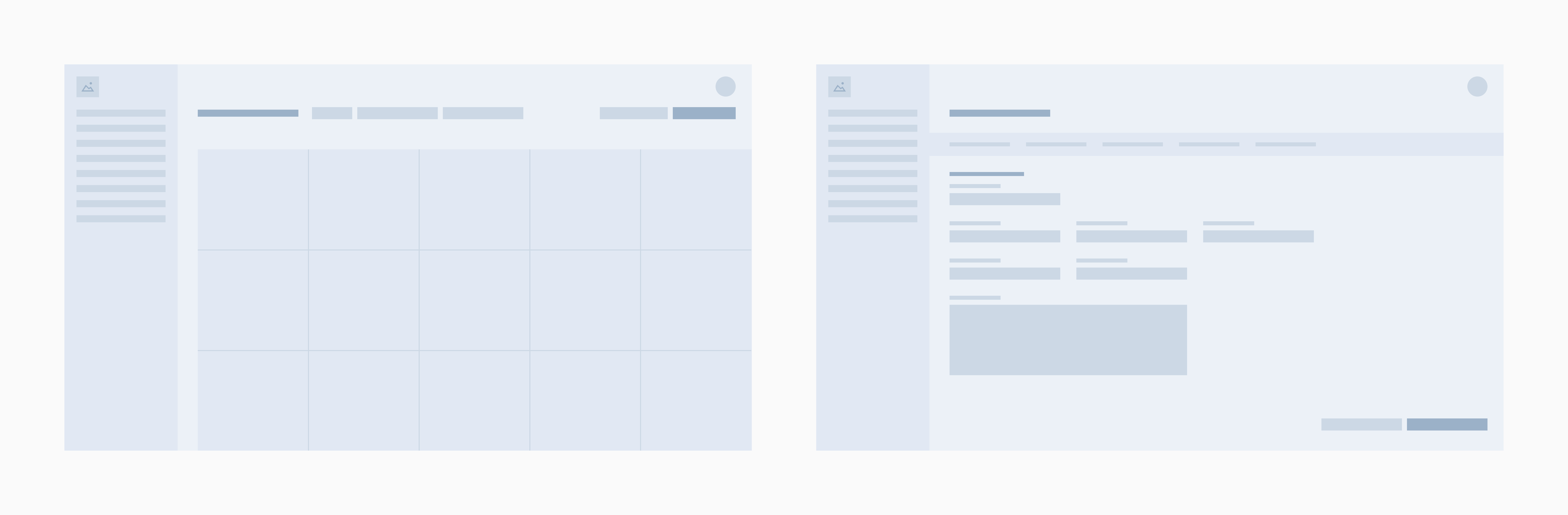
I also created initial user flows to validate navigation and booking processes, confirming our approach before investing in high-fidelity designs.
Exploratory wireframes and user flows helped:
- Identify and address friction points early.
- Align stakeholders on UX direction.
- Set clear foundations for the detailed design phase.
Looking Ahead to Phase Two
Phase One was all about discovery — uncovering pain points, understanding user needs, and laying the groundwork for meaningful change. Every insight has shaped a clearer, more user-centered direction for the platform.
Now, it’s time to bring that vision to life. Stay tuned for Phase Two, where we’ll bring these ideas to life and refine them through user testing and iteration.