✨ Executive Summary
The Rules Engine is a no-code automation tool built within Vertex’s Unified Experience platform. Designed to streamline repetitive workflows, it empowers users to build complex, condition-based automation stories — all without writing a single line of code.
- Role: Lead UX/UI Designer.
- Team: 1 PM, 3 Engineers, 1 QA.
- Timeline: 6 weeks.
- Challenge: Create a lightweight interface that makes it easy to build and configure advanced automation flows — without overwhelming technical or non-technical users.
- Approach: A lean, iterative process combining UX strategy, progressive disclosure, A/B testing, visual refinement, and accessibility-focused design.
- Outcome: A popup-based interaction model that reinforced clarity and reduced friction, making workflow creation faster, more intuitive, and significantly less error-prone.
- Key Results:
- Users could create workflows more confidently with fewer errors.
- Post-launch feedback confirmed the tool was genuinely transformative — reducing manual effort and saving teams time.
Core Skills Applied
UX strategy • Interaction design • A/B testing • Accessibility • Developer collaboration
Background
At Vertex, I led the design of the Unified Experience application — a self-service platform connecting various Vertex products across client websites. A core feature of this platform was the Rules Engine, which enabled users to automate repetitive tasks by building logic-based workflows through a no-code interface.
Problem & Requirements
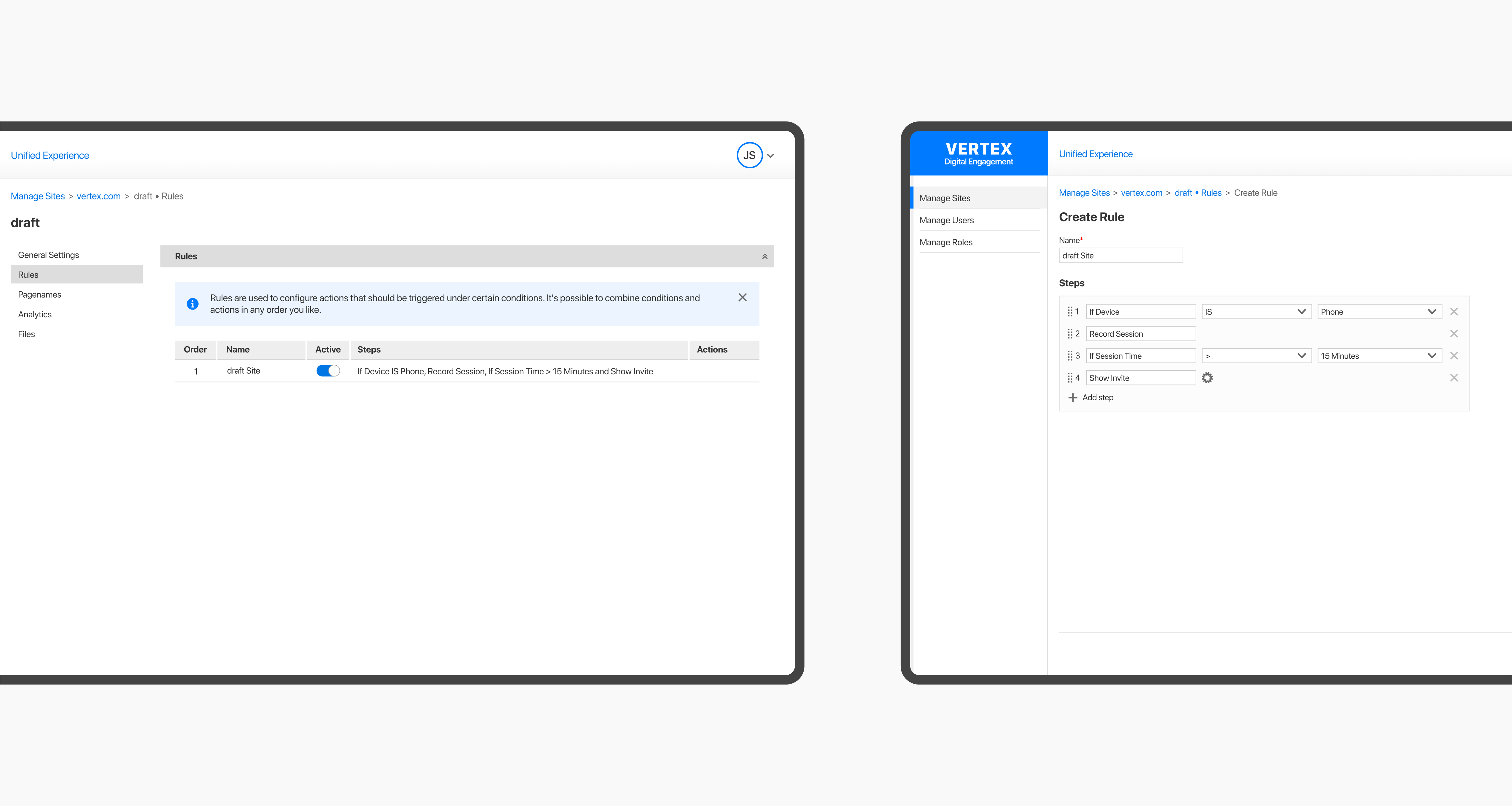
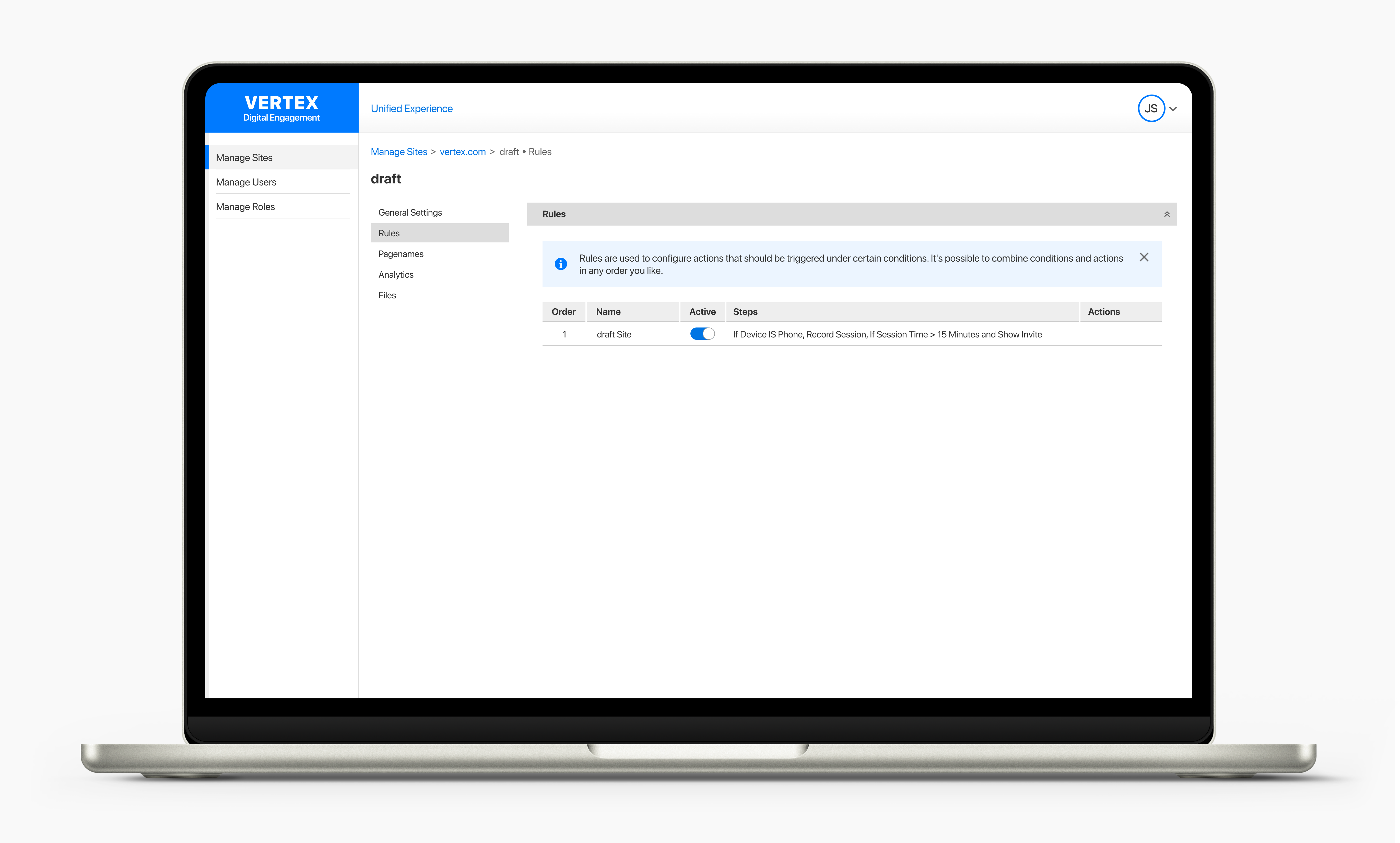
The Rules Engine allowed users to automate workflows by creating “stories” — made up of configurable “steps” that could be assembled, reordered, and triggered based on predefined conditions.
Previously, configuring these workflows was manual, time-consuming, and error-prone. Our challenge was to design an intuitive interface that made it easy to build powerful automation — without overwhelming users with technical complexity. How hard could it be, right? 😅
Rapid Ideation & UX Strategy
With a mature design system in place and deadlines looming, I embraced a lean UX mindset — diving into rapid ideation to move quickly and purposefully. From the outset, I applied the principle of progressive disclosure to create a focused, approachable experience for both technical and non-technical users.

Bitesize UX: Progressive Disclosure
Progressive disclosure is a design technique that simplifies complex systems by revealing information only when it’s relevant to the task at hand. It helps reduce cognitive load, making interfaces easier to learn and less overwhelming—a must-have in any UX designer’s problem-solving toolkit!
My first concept reflected that thinking: a dropdown-based selection process that allowed users to pick and configure steps quickly. It was neat, compact, and familiar.
Initial feedback was promising—users appreciated the simplicity. But the approach had limitations:
- There was a lack of space for contextual information, such as icons or descriptions.
- As more steps were added, the dropdown extended beyond the main content area and was obscured behind the footer:
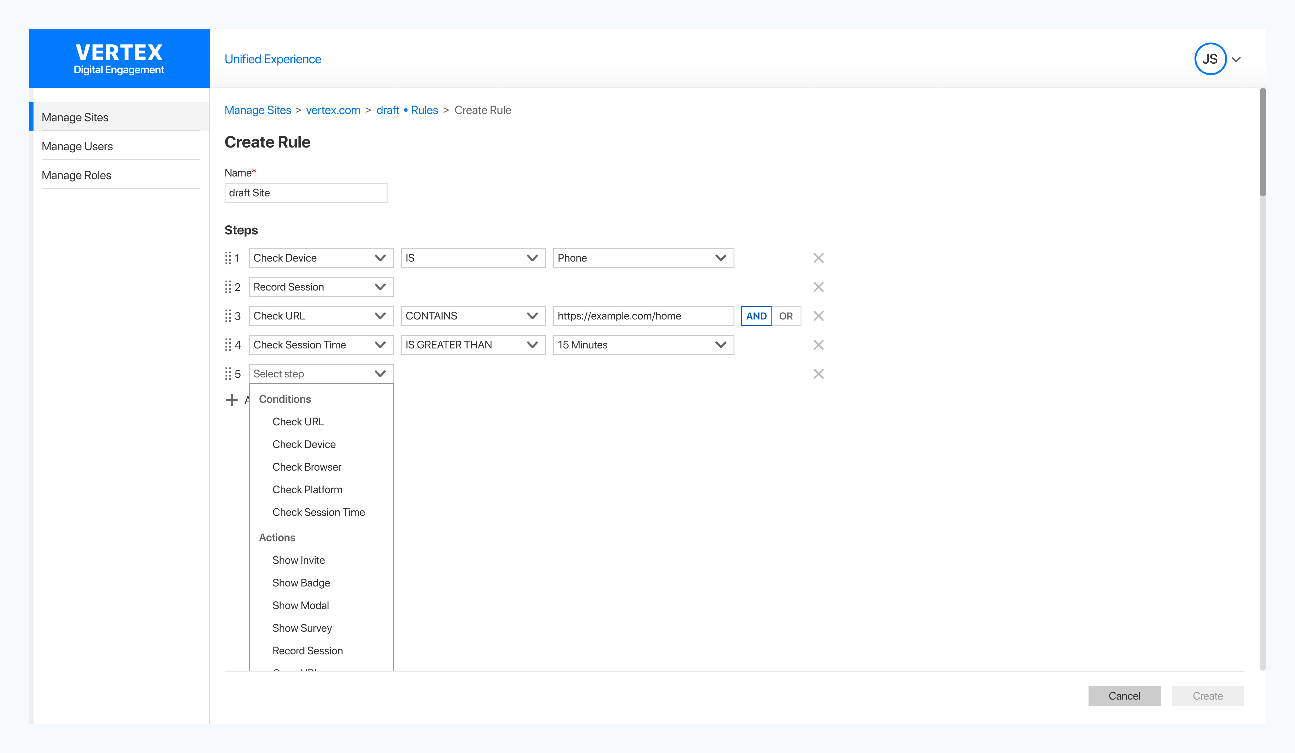
I wasn’t convinced this was the right solution. But I also believed in showing the full journey—even failed ideas provide valuable insights, and each iteration strengthened the next.
We needed a more scalable solution — one that offered context without compromising usability.
Iterations & Insights: A/B Testing
To move beyond the limitations of the dropdown menu, I explored two concepts in parallel:
- A pane-based interface, which provided more space for contextual information.
- A popup-based interaction, which aimed to reinforce proximity and improve step selection flow.
At this point, I also explored a few more unconventional concepts behind the scenes. While they showed potential, I ultimately discarded them in the interest of time and implementation complexity.
Concept A: The Pane-Based Approach
This version allowed users to scan and select steps without affecting the main content area. It had clear benefits:
- Users could browse conditions and actions without disrupting their workflow.
- More space was available to contextualize conditions and actions.
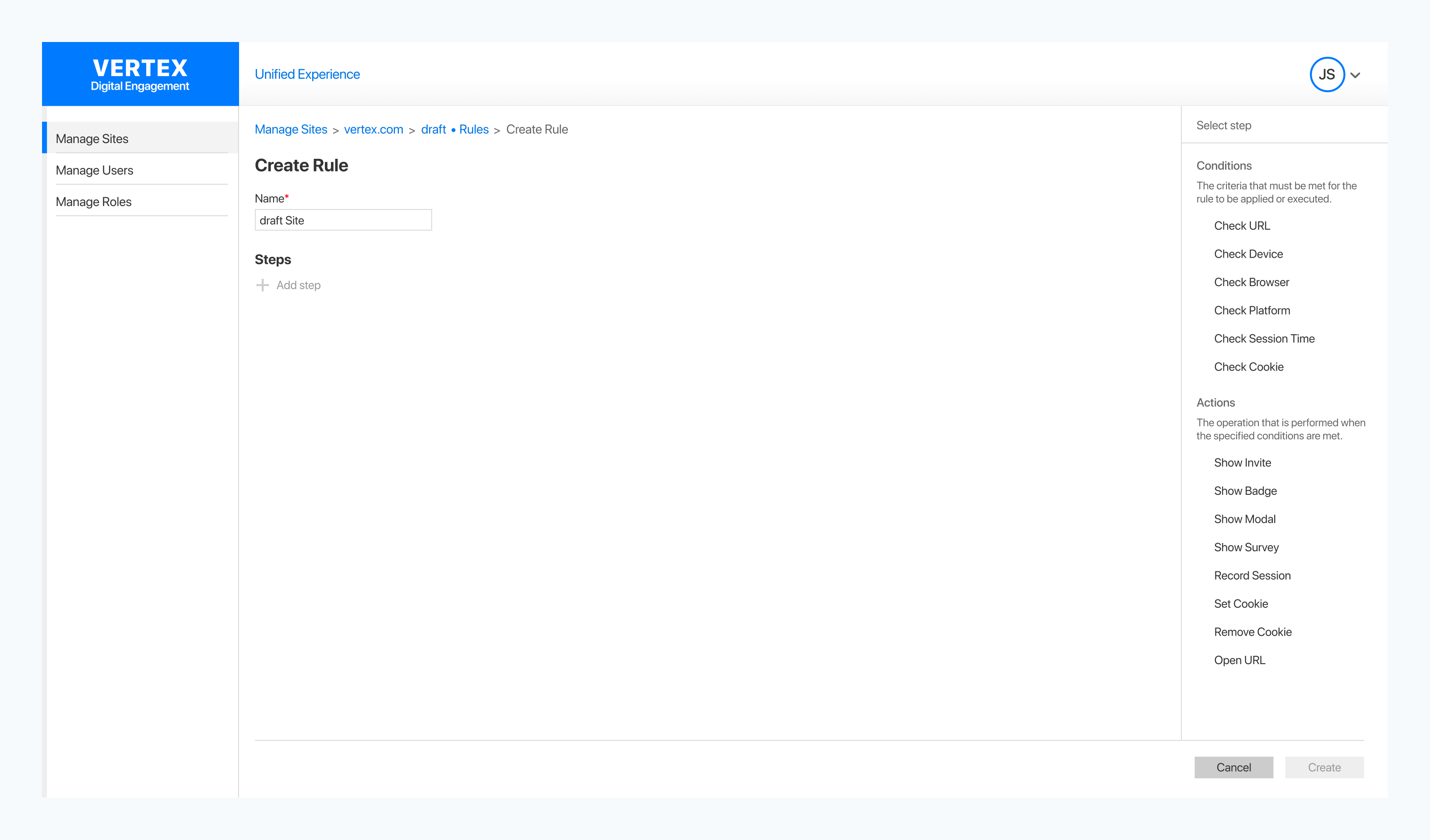
At first, this seemed like a step in the right direction. However, testing revealed critical flaws:
- The ‘Add Step’ button and step selection felt disconnected—users initiated a step in the pane but configured it elsewhere.
- The pane’s behavior was unclear—should it always be open or require activation?
- Users found the dynamic content shifting disorienting and distracting.
To address these issues, I tested a version where the pane remained visible at all times, eliminating the need for expand-and-collapse interactions. This stabilized the experience, but something still felt off—the disconnect between the ‘Add Step’ button and step selection persisted. These elements were interrelated, and it was crucial to establish that connection.
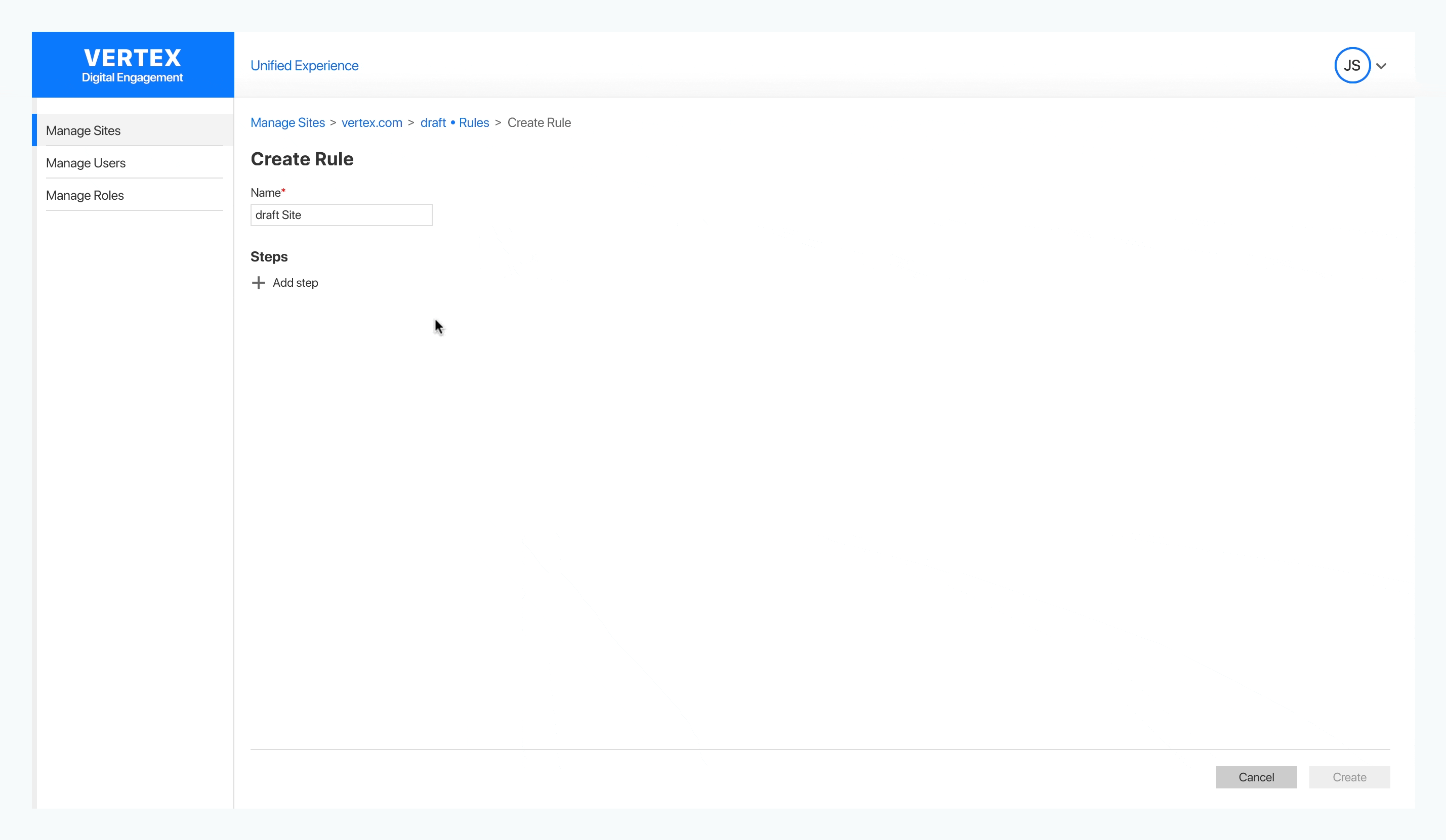
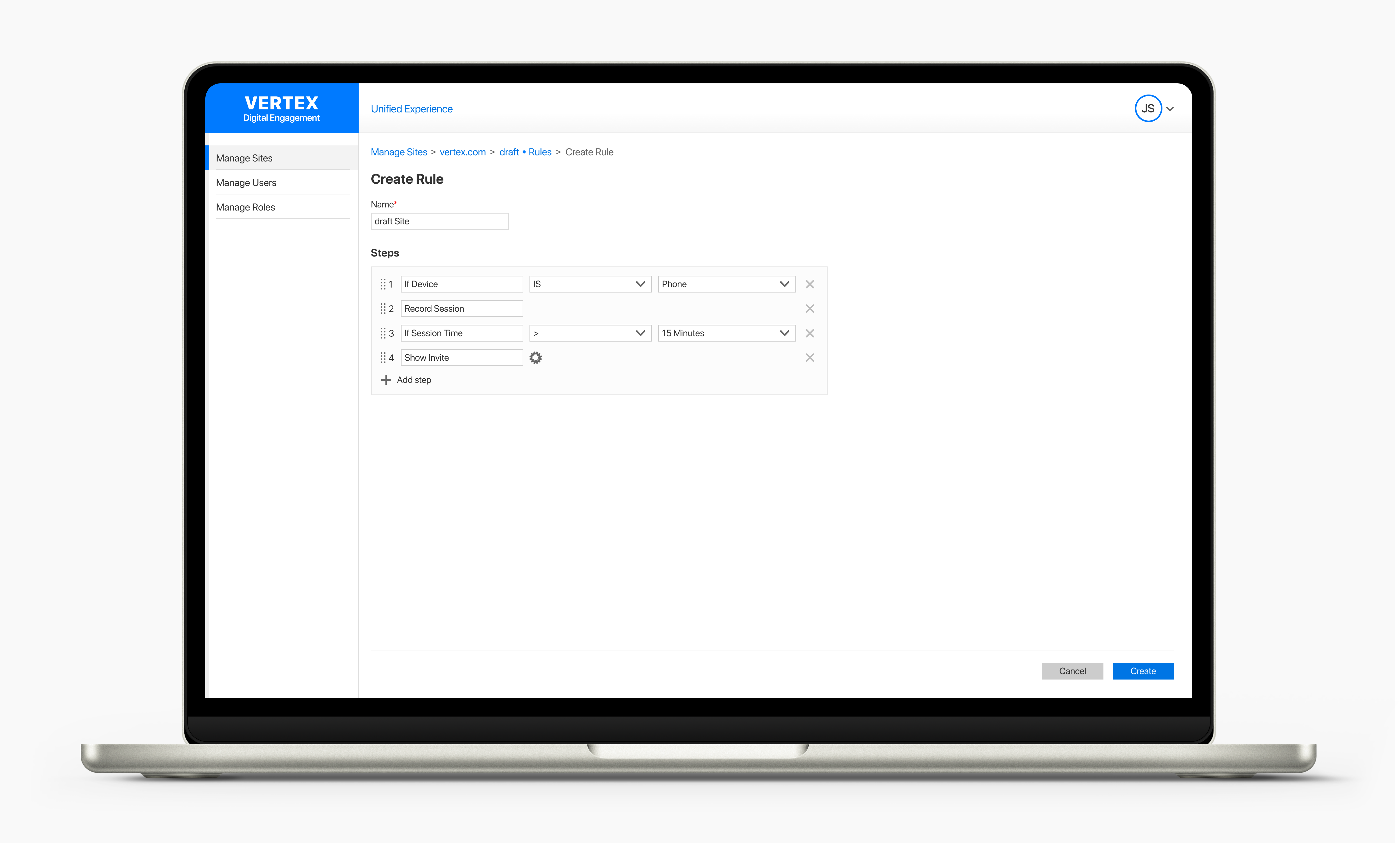
Concept B: The Popup-Based Approach
To test an alternative, I applied one of design’s core principles: proximity. Instead of a static pane, I explored a dynamic popup that appeared directly next to the ‘Add Step’ button, ensuring a seamless connection between selection and configuration.
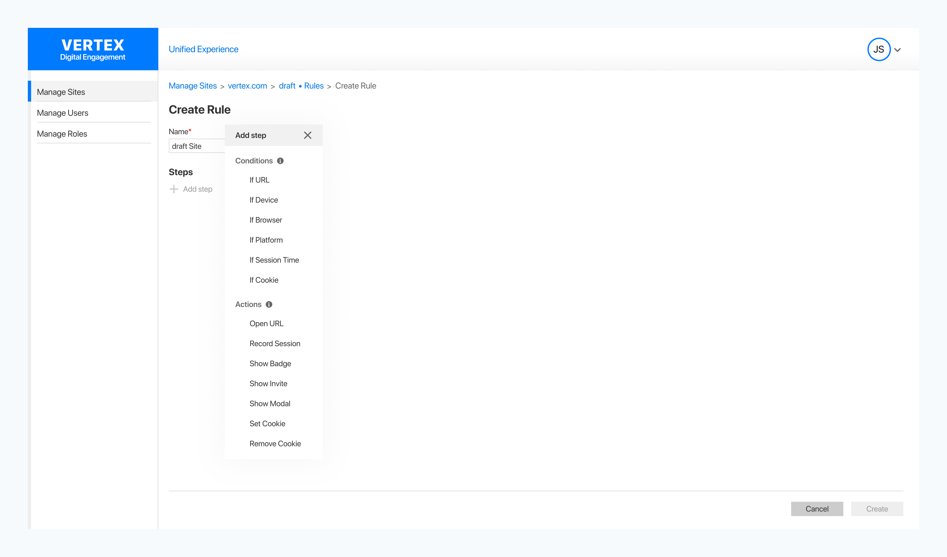
The results were immediate and impactful—this approach resolved key usability challenges:
- Reinforced the connection between the ‘Add Step’ button and step selection.
- Used tooltips to provide context without adding clutter.
- Optimized width to minimize content obstruction.
Key Takeaways from A/B Testing
Through testing, the popup-based solution outperformed the pane-based approach in terms of usability, efficiency, and user confidence. Based on these observations, we decided this was the best direction.
With the UX mechanics in place, I turned my attention to visual refinement. I introduced a subtle container around the steps, enhancing visual distinction and reinforcing structure.
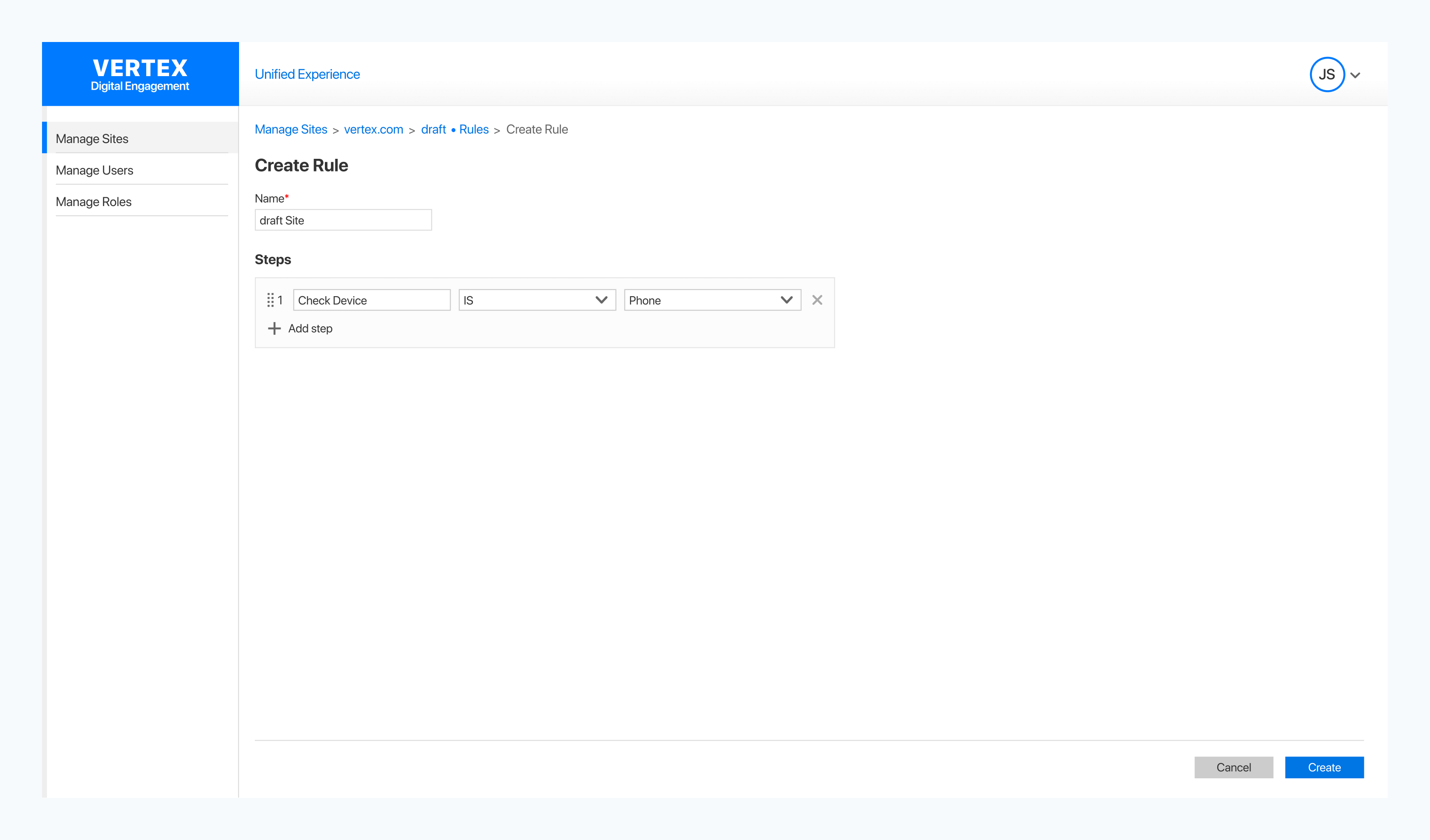
This small addition sharpened focus, strengthened the step configuration space, and made step creation feel seamless.
I also experimented with icons to enhance the visual design, but this introduced inconsistencies and user feedback confirmed that icons added visual clutter. In the end, we decided the best course of action was a text-based approach to ensure consistency and readability.
Inclusive UX
Accessibility was built into the foundation of the experience—not an afterthought. We aimed to create an inclusive experience by focusing on the following:
- Keyboard & Focus Support: All components were accessible via keyboard, with proper tab navigation, visible focus states, and no keyboard traps—making modals and interactions easy to enter and exit.
- Screen Reader Compatibility: We used semantic HTML and structured headings to support screen readers. While we couldn’t test with assistive tech users, we did validate key flows using VoiceOver.
- Dev Collaboration: I worked closely with developers throughout the process and used the WAVE plugin to catch contrast issues, alerts, and structural errors, and provided implementation guidance aligned with our design system to support smooth implementation.
Lessons Learned
- Simplicity is key. Exploring multiple ideas is valuable, but knowing when to cut weaker concepts is just as important.
- Sketch first. Jumping straight into digital design sometimes slowed me down. Quick sketches could have streamlined decision-making.
This experience reinforced the beauty of simplicity and the importance of efficiency in the design process.
Reflection
Despite a few hair-greying moments, this process taught me a lot. Post-launch, we received consistent feedback that the tool we developed was truly transformative — workflows became easier to configure, manual effort was reduced, and errors were minimized. Users could now build automation seamlessly, freeing them to focus on strategic work instead of repetitive tasks. We crafted designs that turned a once cumbersome process into an efficient experience — empowering teams streamline their workflows and watch their tasks execute like clockwork. 🚀
Looking back, this project reinforced a key lesson: great design is a balance of functionality, clarity, and user experience. And sometimes, the simplest solutions are the most powerful.
Check out the interactive prototype here: Figma Prototype