✨ Executive Summary
Habiits is a mobile app designed to help users build healthier daily routines across sleep, nutrition, mindfulness, and activity. Through extensive research, self-guided trials, and usability testing, I shaped a solution that makes wellbeing approachable, sustainable, and genuinely empowering.
- Role: Founder.
- Team: Me, myself, and I!
- Timeline: 6 months.
- Challenge: Address the growing mental health crisis with an app that promotes lasting behaviour change.
- Approach: A comprehensive end-to-end process combining market research, user research, behavioural validation, content strategy, iterative prototyping, usability testing, and much, much more.
- Outcome: A user-friendly, habit-forming experience that balances structure and flexibility — encouraging small daily wins that compound over time.
- Key Results:
- SUS scores improved significantly after refining key interactions.
- Positive user feedback on simplicity, motivation, and ease of navigation.
Core Skills Applied
UX research • Flow design • Usability testing • Iterative prototyping • Information Architecture
Exploring Ideas
Before committing to a concept, I explored a range of design directions through mind mapping. I branched out from themes like wellbeing, social connection, personal growth, and accessibility — connecting topics and spotting potential opportunities.
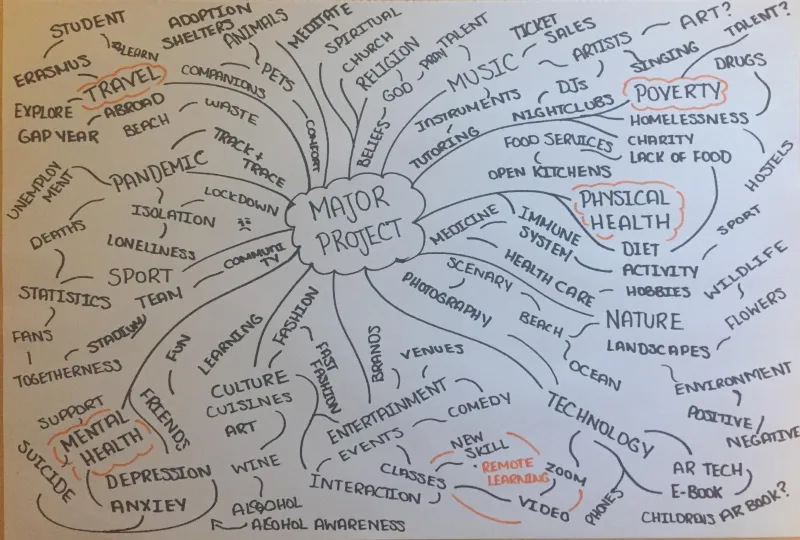
From there, I began researching a few of these areas to see where unmet user needs existed. As I dug into the mental health space, it quickly became clear how urgent the need was — and how many people were struggling without accessible, empowering tools.
Problem Identification
Mental health issues are more prevalent than ever — 1 in 4 people experience them, and antidepressant use continues to rise. The pandemic only amplified this, with anxiety and depression surging globally.
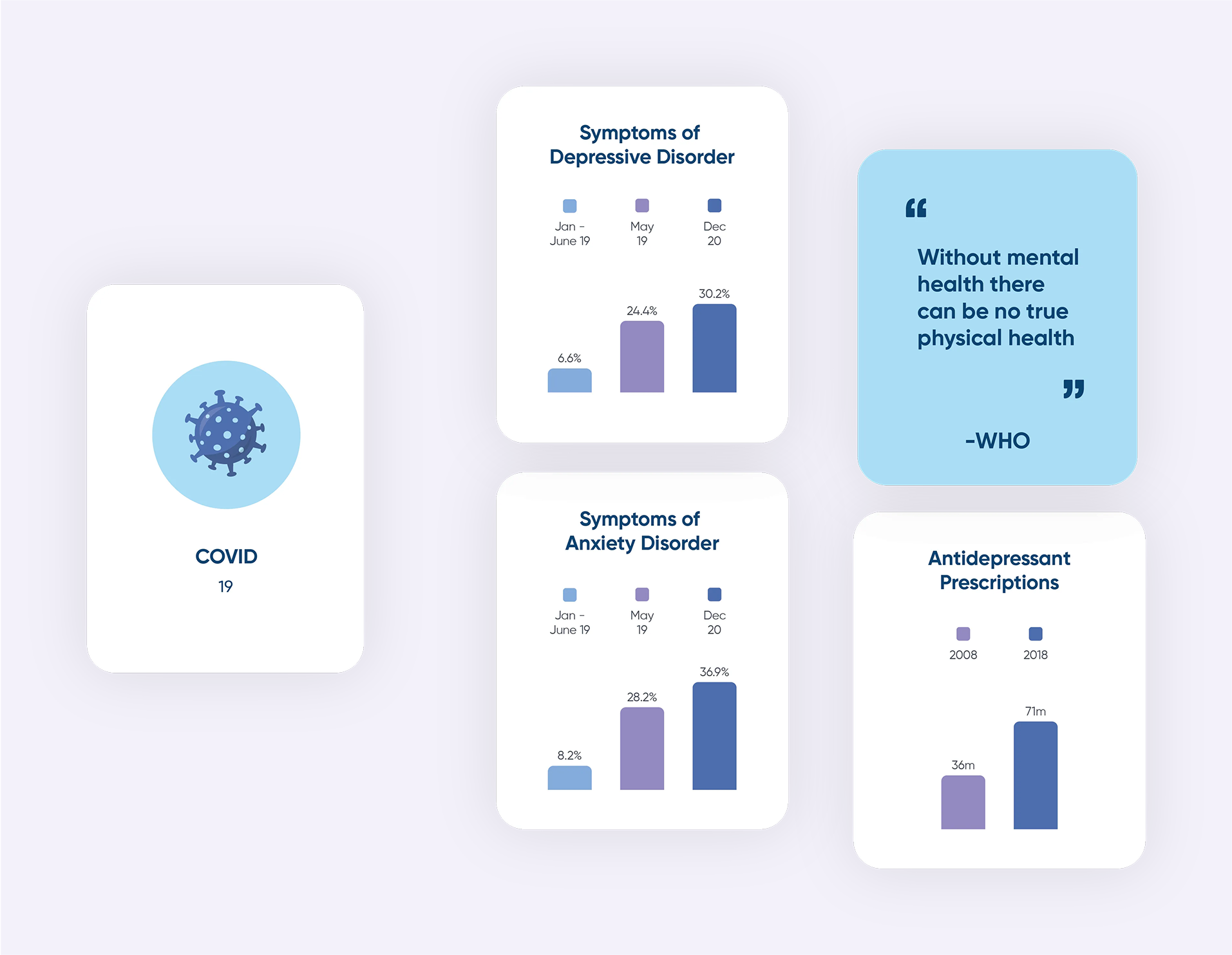
Despite the growing number of wellness apps, many rely on external motivation and don't support lasting behaviour change. I saw an opportunity to create something more meaningful: a tool that promotes sustainable mental wellness and empowers people to build healthier routines on their own terms.
Market Research
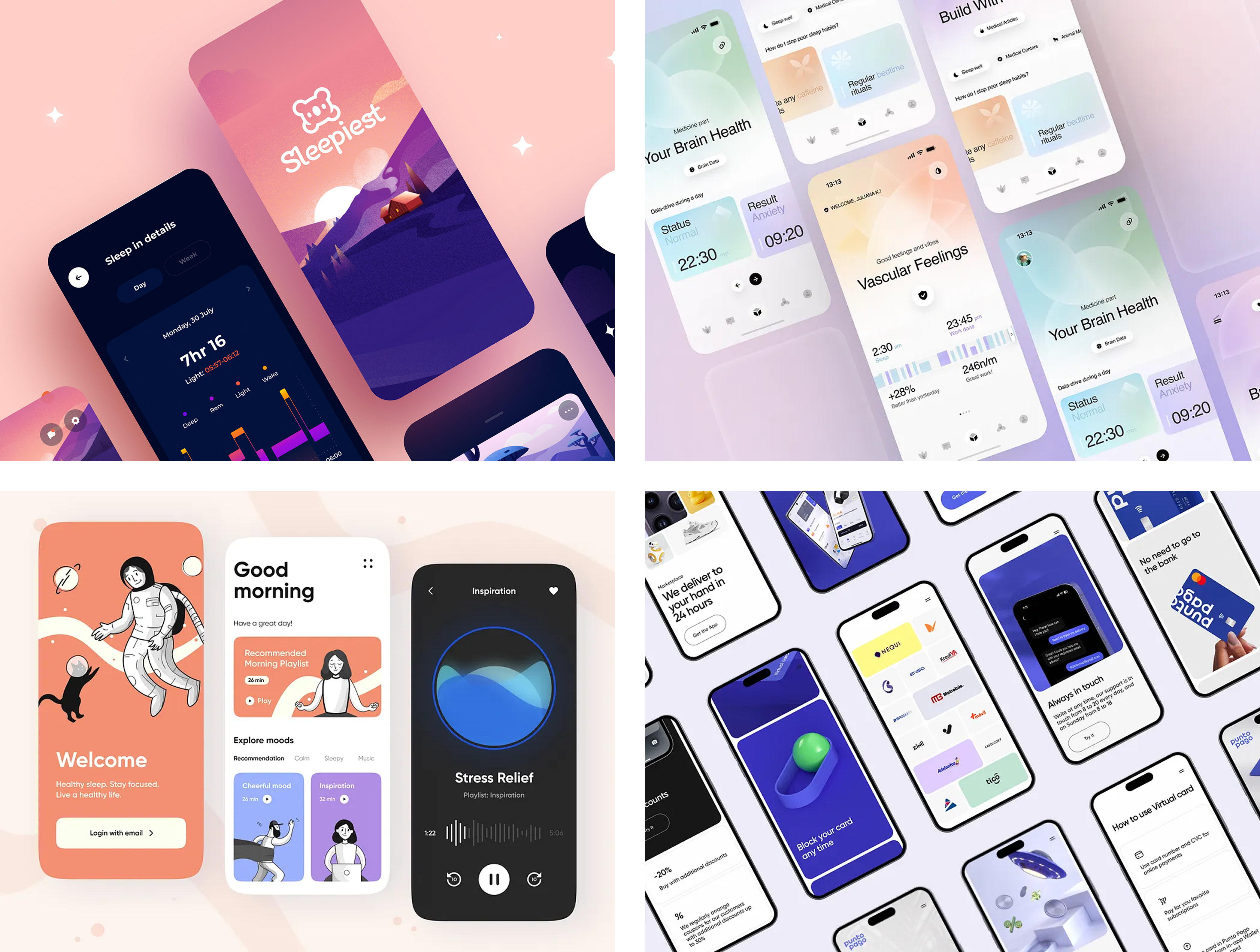
To understand what was working in the wellness space, I conducted UX audits on Calm and Headspace — two of the most established apps in the category. Both apps excelled at creating a calming, engaging experience through welcoming onboarding, clear navigation, and consistent visual language. But they also revealed gaps: limited personalisation, occasional friction in user flows, and opportunities to streamline content structure.
These findings gave me a clear starting point for Habiits — helping me identify patterns worth emulating, as well as areas to differentiate and improve. I also used a moodboard to capture early ideas around tone, colour, and atmosphere to support a calming, habit-forming experience.
User Research
To understand the real-world needs, goals, and frustrations of potential users, I created a survey combining both quantitative and qualitative questions. Participants shared how they manage their mental health, what habits they value most, and what they expect from a wellness app. Using affinity mapping, I surfaced recurring themes across participant responses, which helped guide early feature direction.
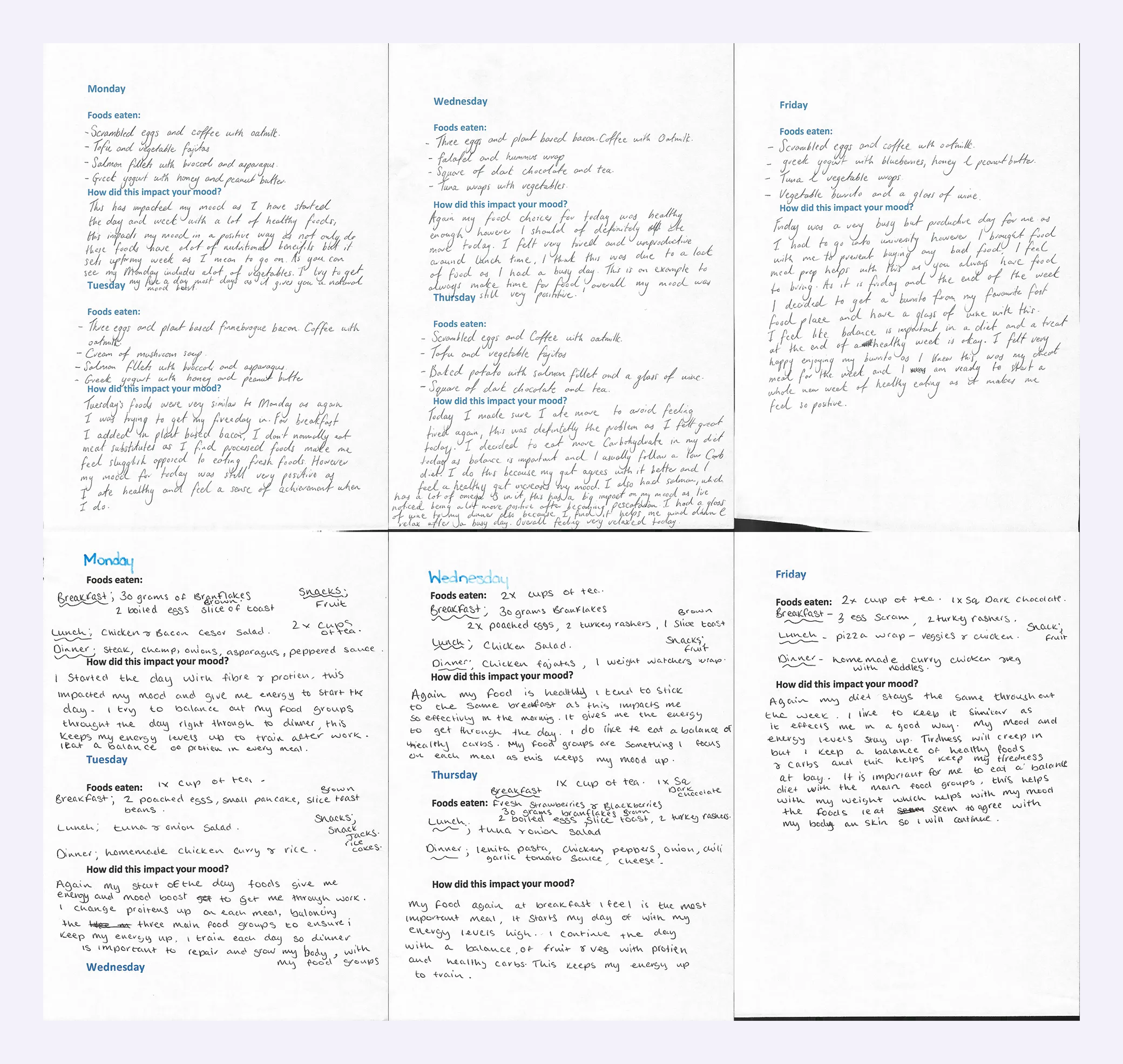
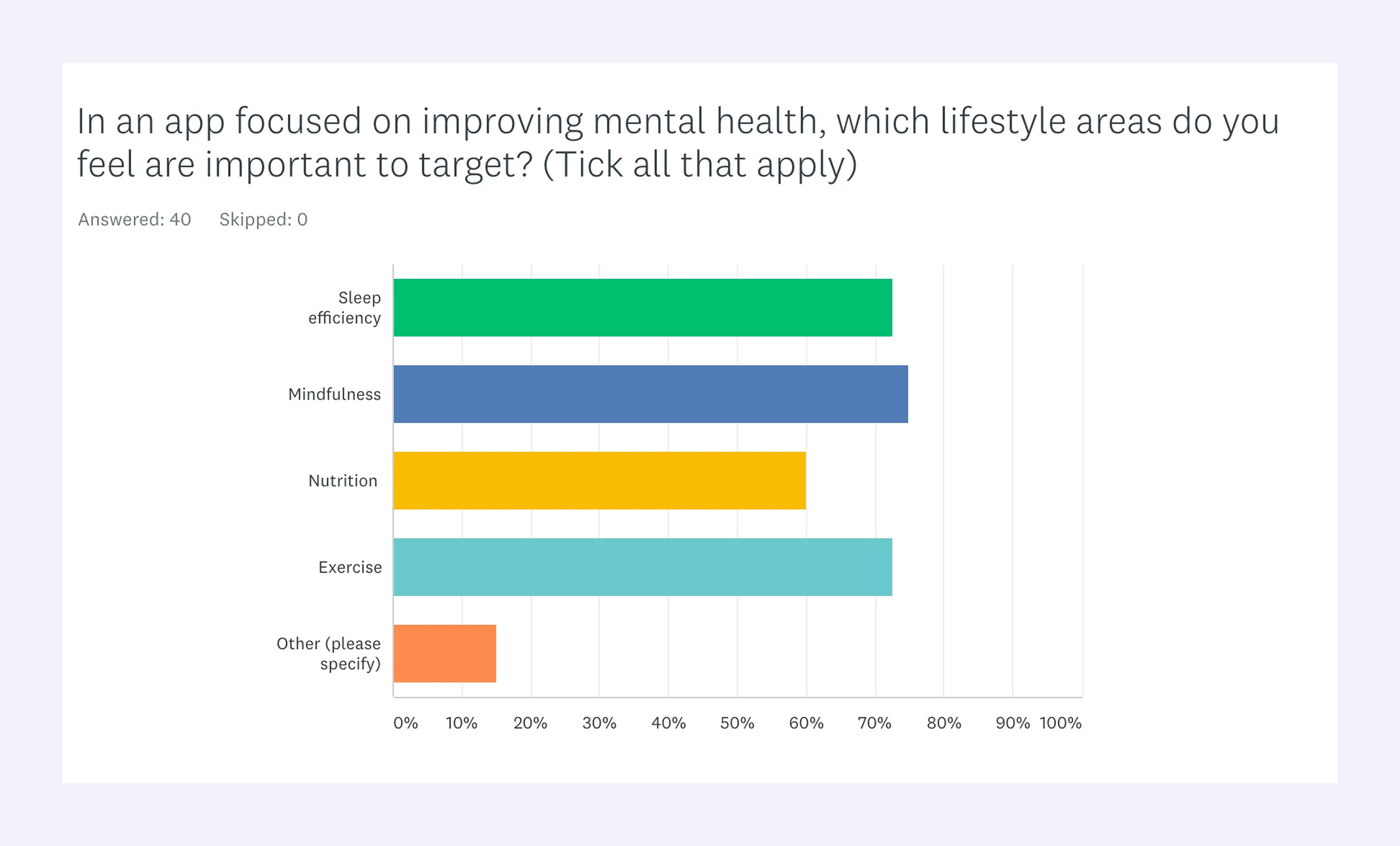
Initially, I planned for Habiits to focus on sleep, mindfulness, and nutrition. But the research highlighted physical activity as a major contributor to mental wellbeing. To further validate these insights, I organised a series of self-guided habit trials with a small group of participants, who adopted new habits across all four areas and documented their mood and behavioural reflections.
Survey responses highlighted four key lifestyle areas as the highest priorities for supporting mental wellbeing. Based on this research, the platform evolved to centre around four core pillars that directly reflected user needs: sleep, nutrition, mindfulness, and activity. These insights shaped both the app’s content and its information architecture, ensuring each section had purpose and strong alignment with real user goals.
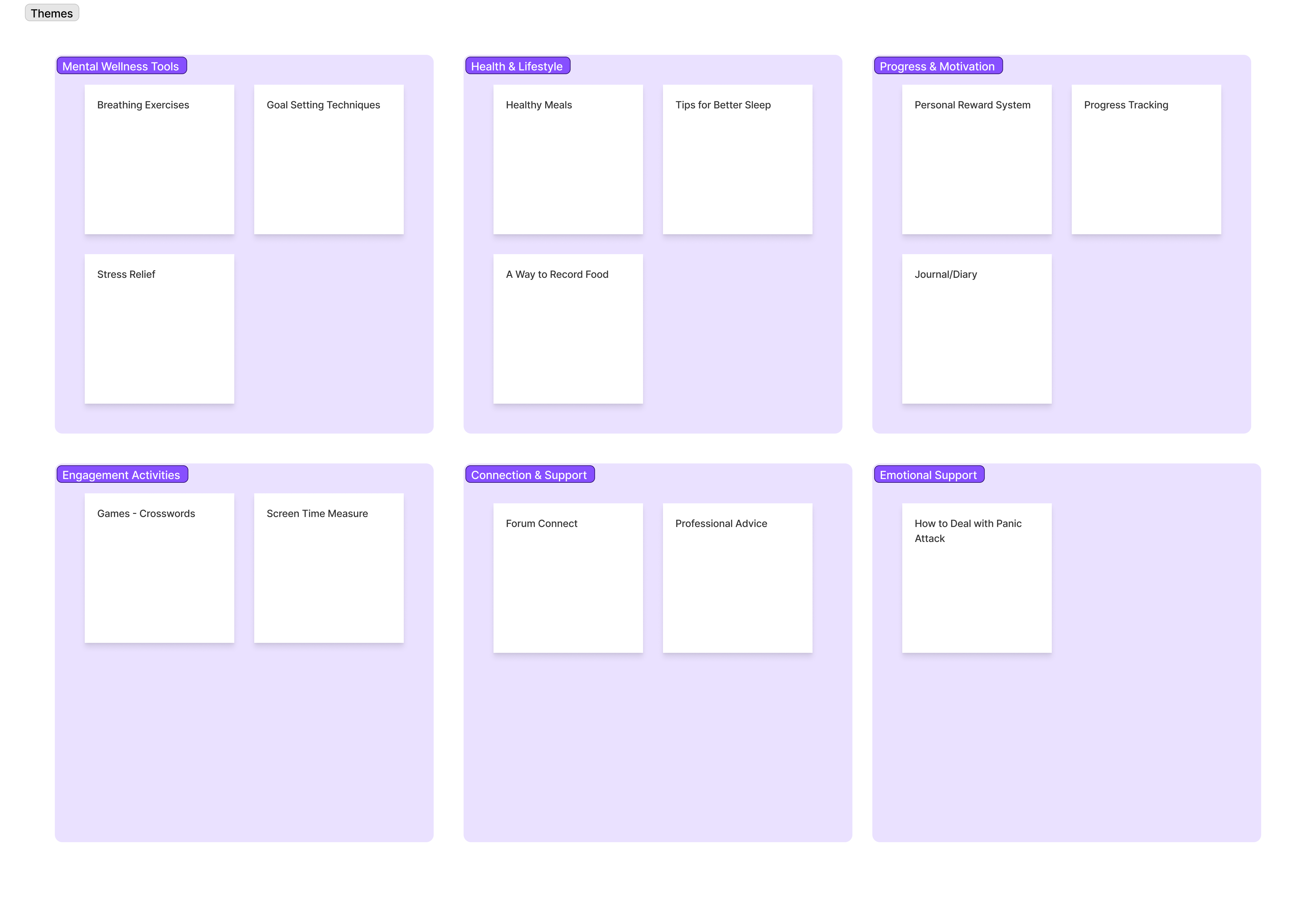
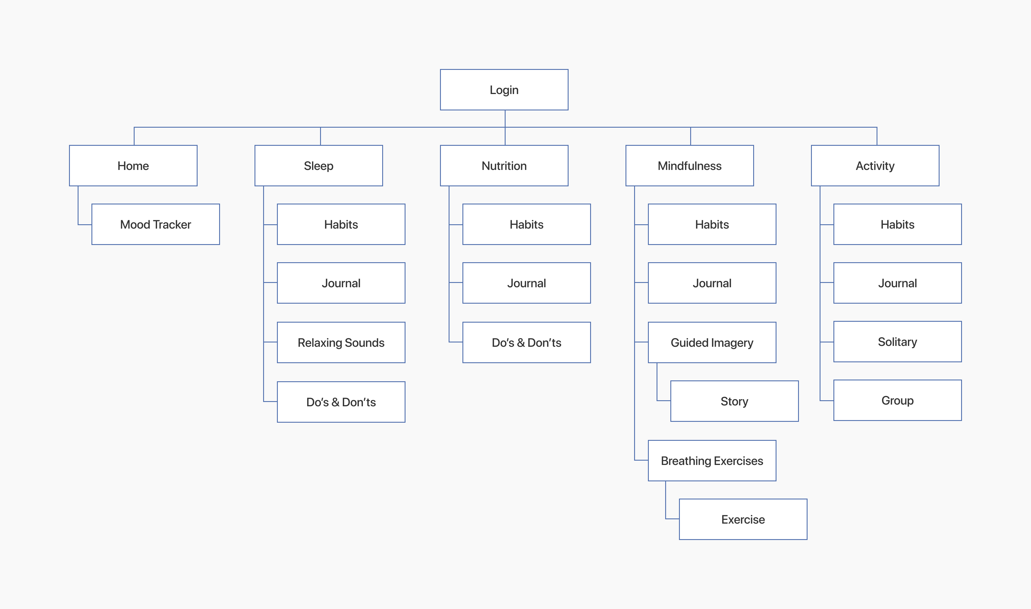
Content Strategy & Information Architecture
With the four core wellbeing areas defined and validated, the next step was to structure them into an experience that felt clear, approachable, and easy to navigate. To support this, I mapped out a simple site architecture that grouped key features under each wellbeing pillar and ensured that core actions remained accessible throughout the experience.
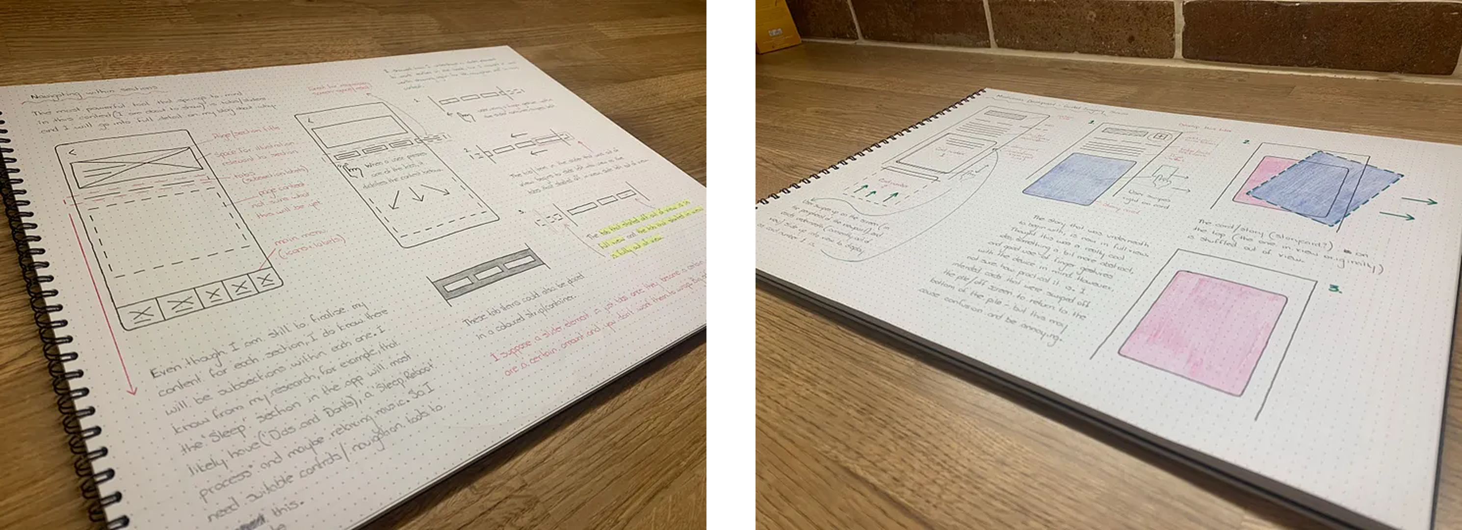
Sketching
Before diving into Figma, I explored layout ideas, interaction patterns, and visual hierarchy through rough sketching. This analogue phase helped me explore freely, quickly validate layout ideas, and gain clarity on structure, flow, and screen relationships — ultimately laying the foundation for wireframing and user flows.
Wireframes
Using the learnings from sketching and research, I moved into wireframing to map out the key UI components and layout logic for each section of the app. This step was essential for refining content structure, simplifying flows, and planning for consistency across the four core wellbeing areas.
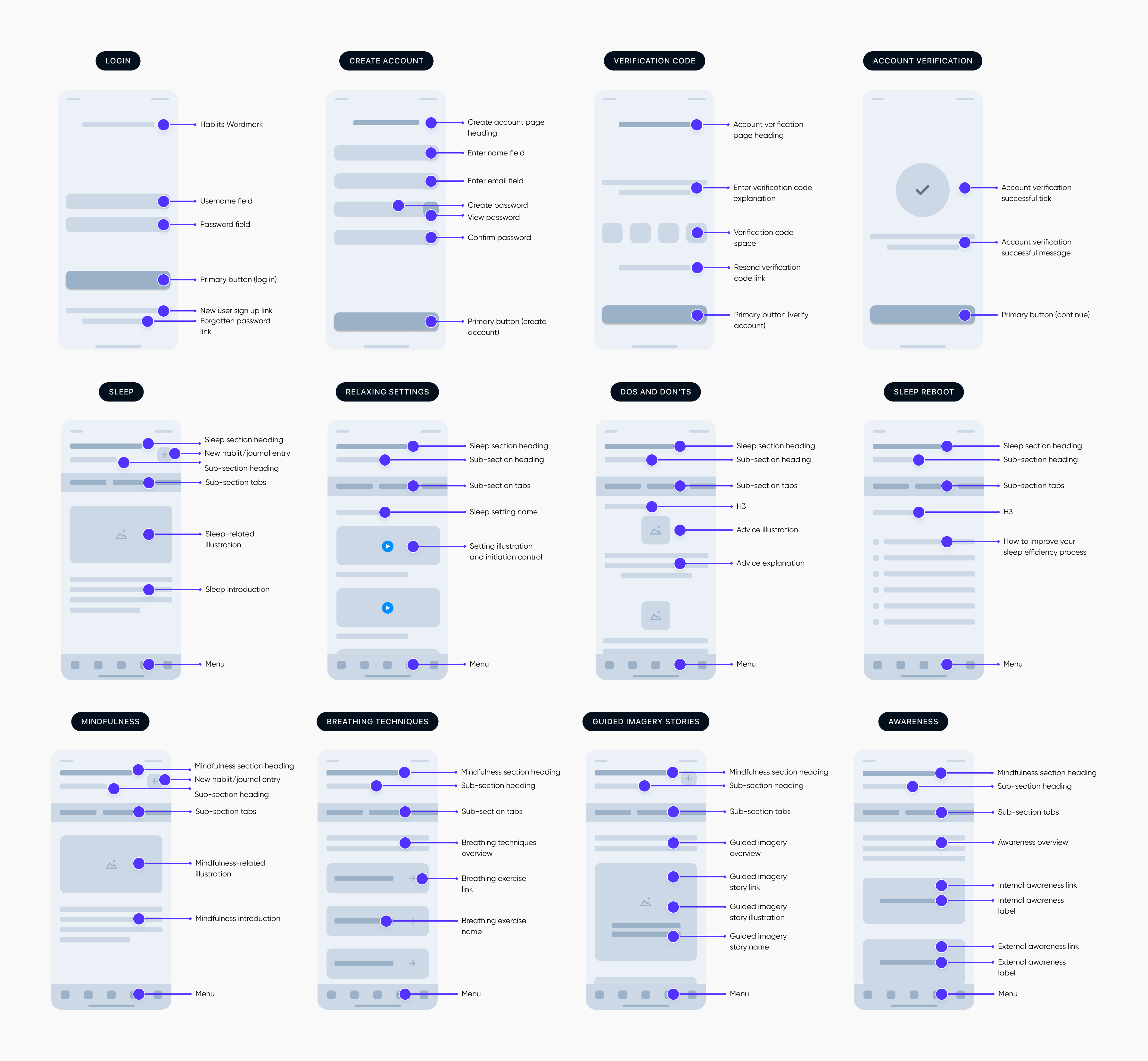
These early frames acted as a reference for collaboration, allowing me to gather feedback from peers and mentors while continuously refining layout decisions before moving into higher fidelity.
User Flow
To bring the experience together, I mapped out a comprehensive user flow (for simplicity, I’ve just included the registration/signup journey below). This helped visualise how users would move through the app, spot any friction points early, and refine navigation before moving into development.
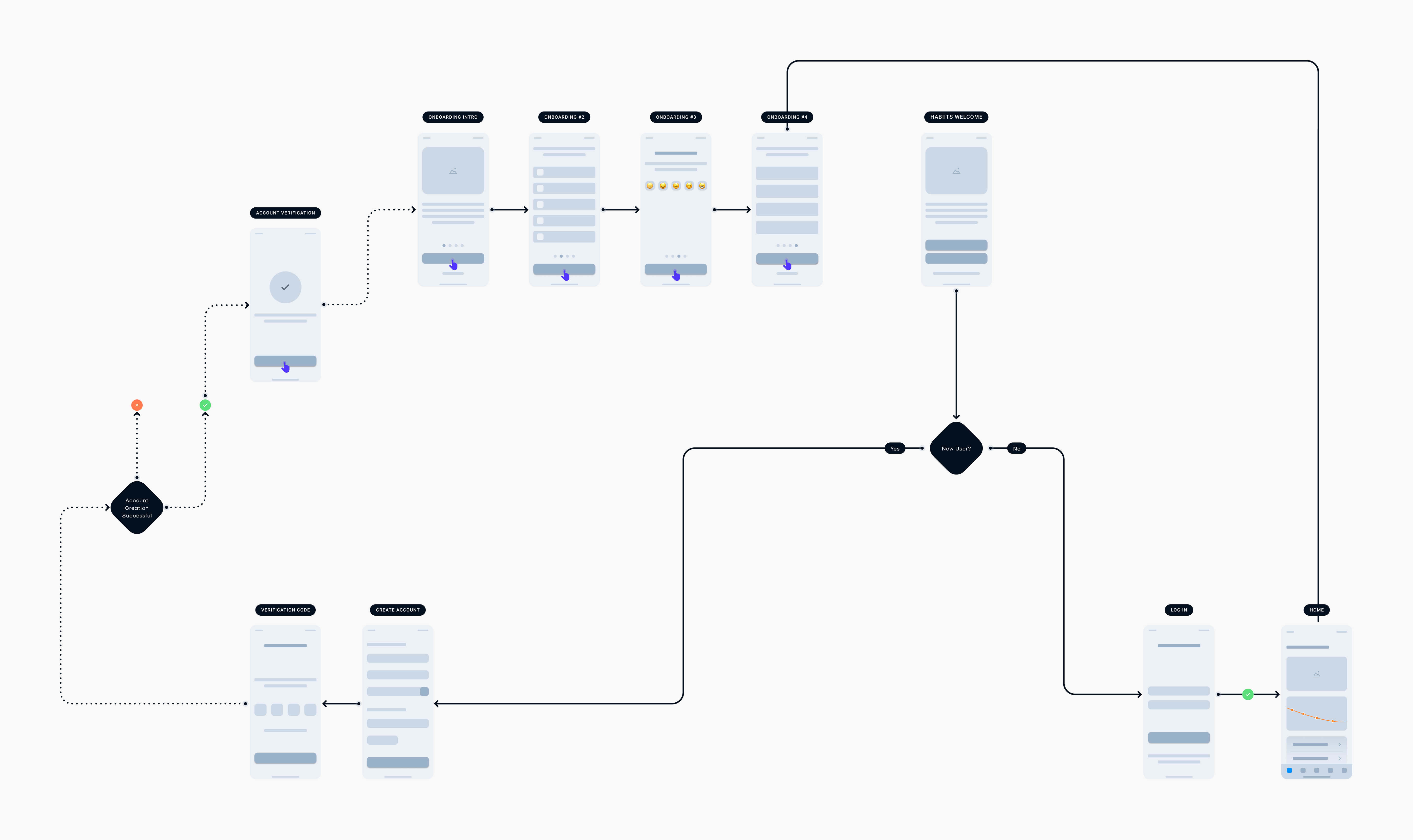
This flow became the blueprint for building out an MVP — a clickable prototype that captured the core functionality and allowed me to conduct early usability testing.
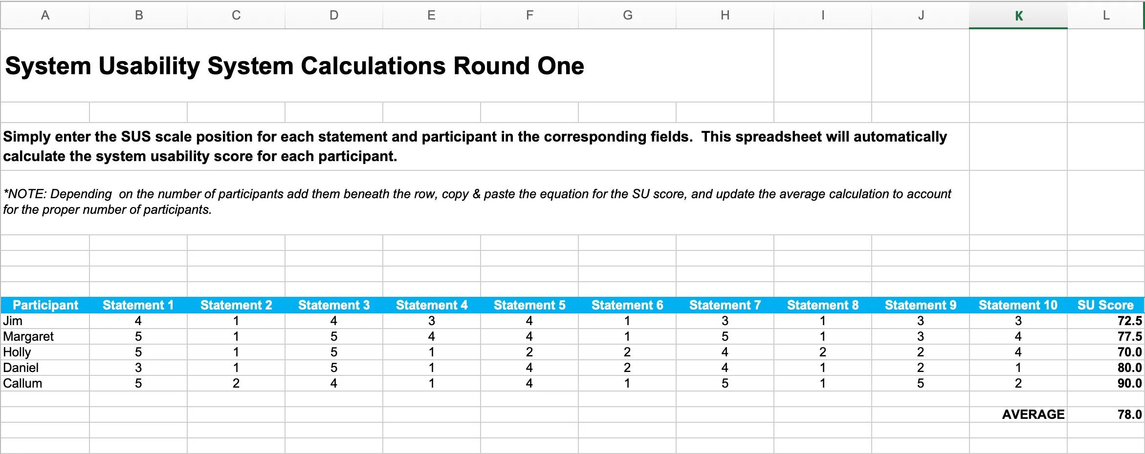
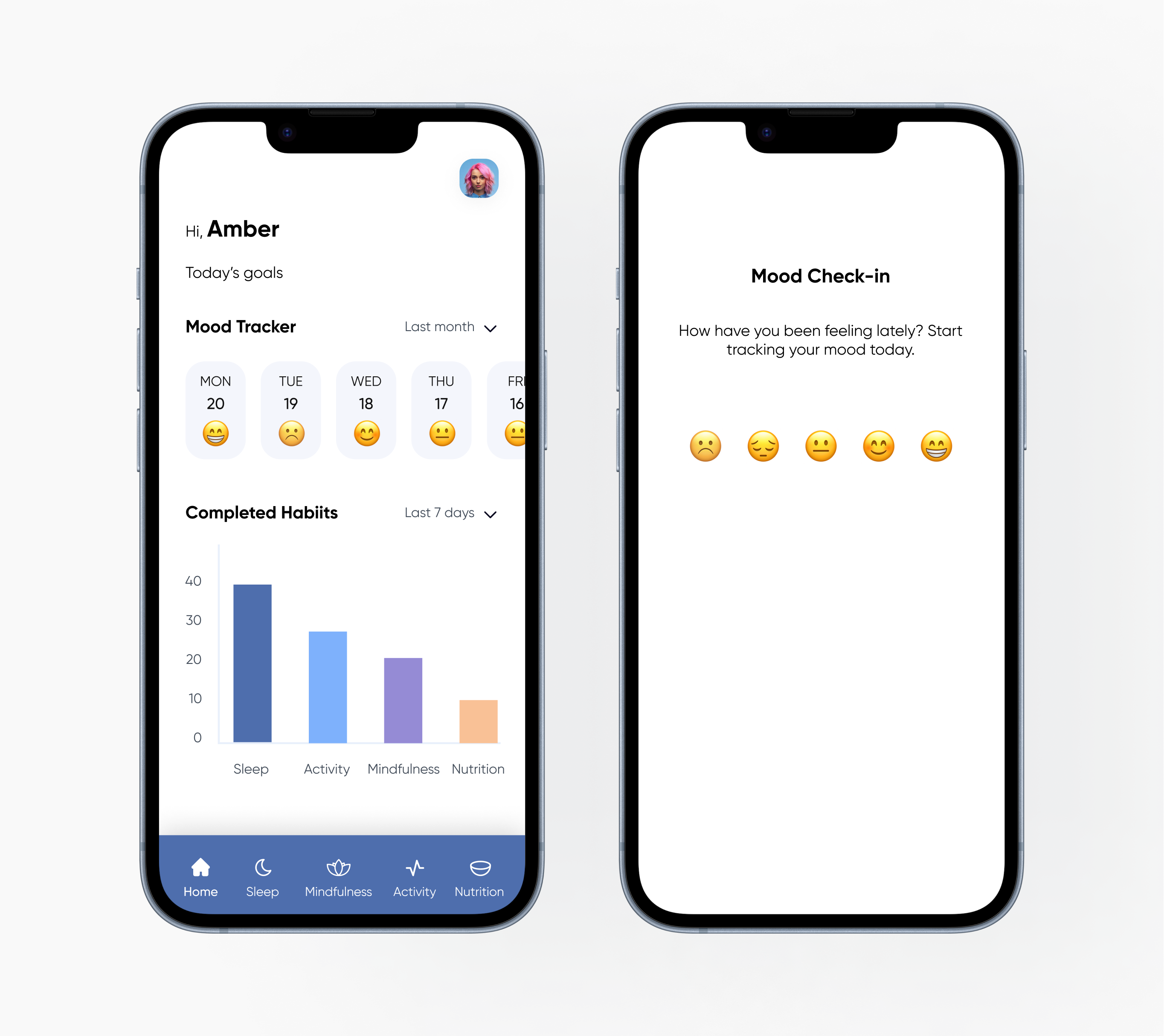
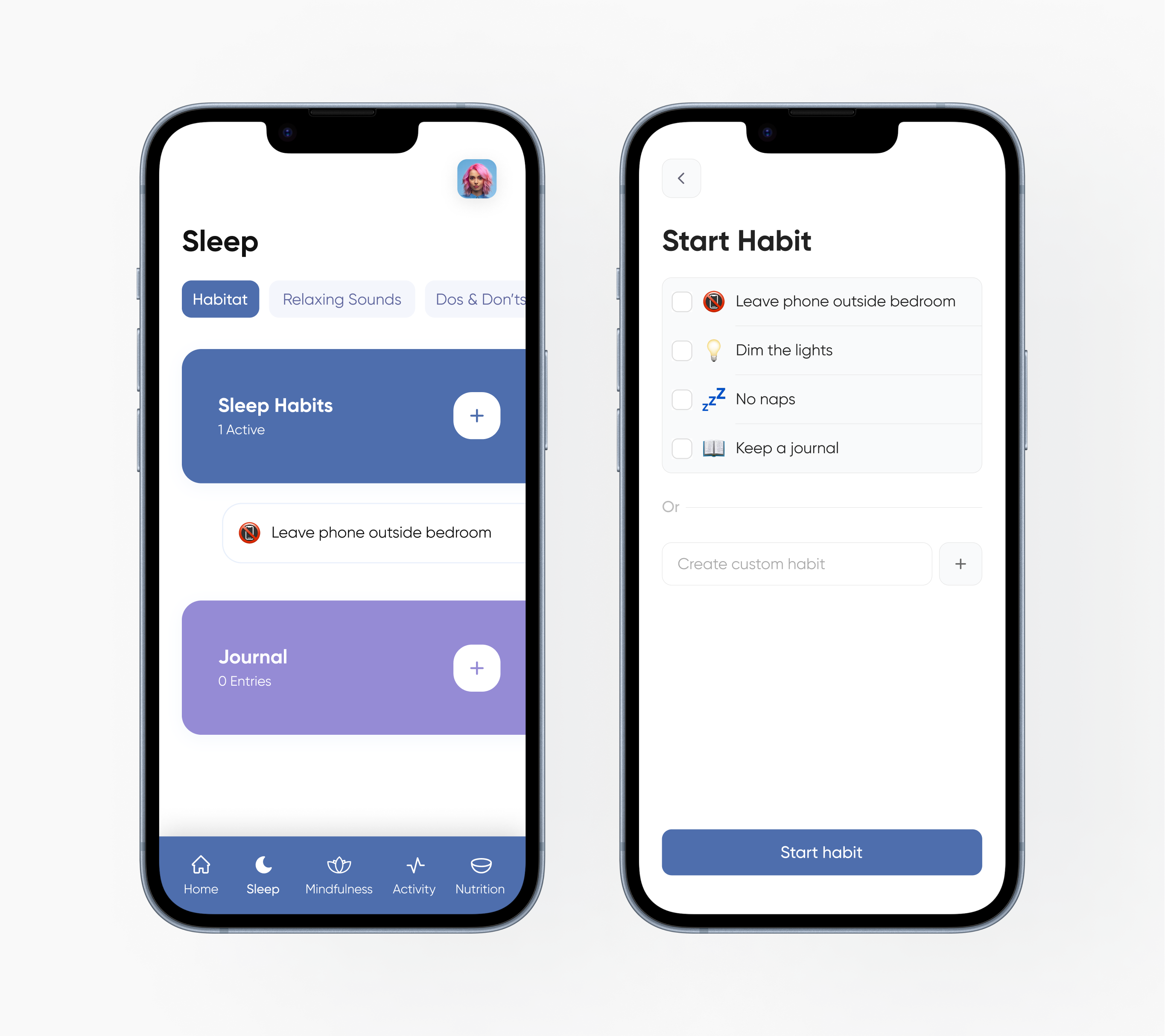
Usability Testing & Iteration
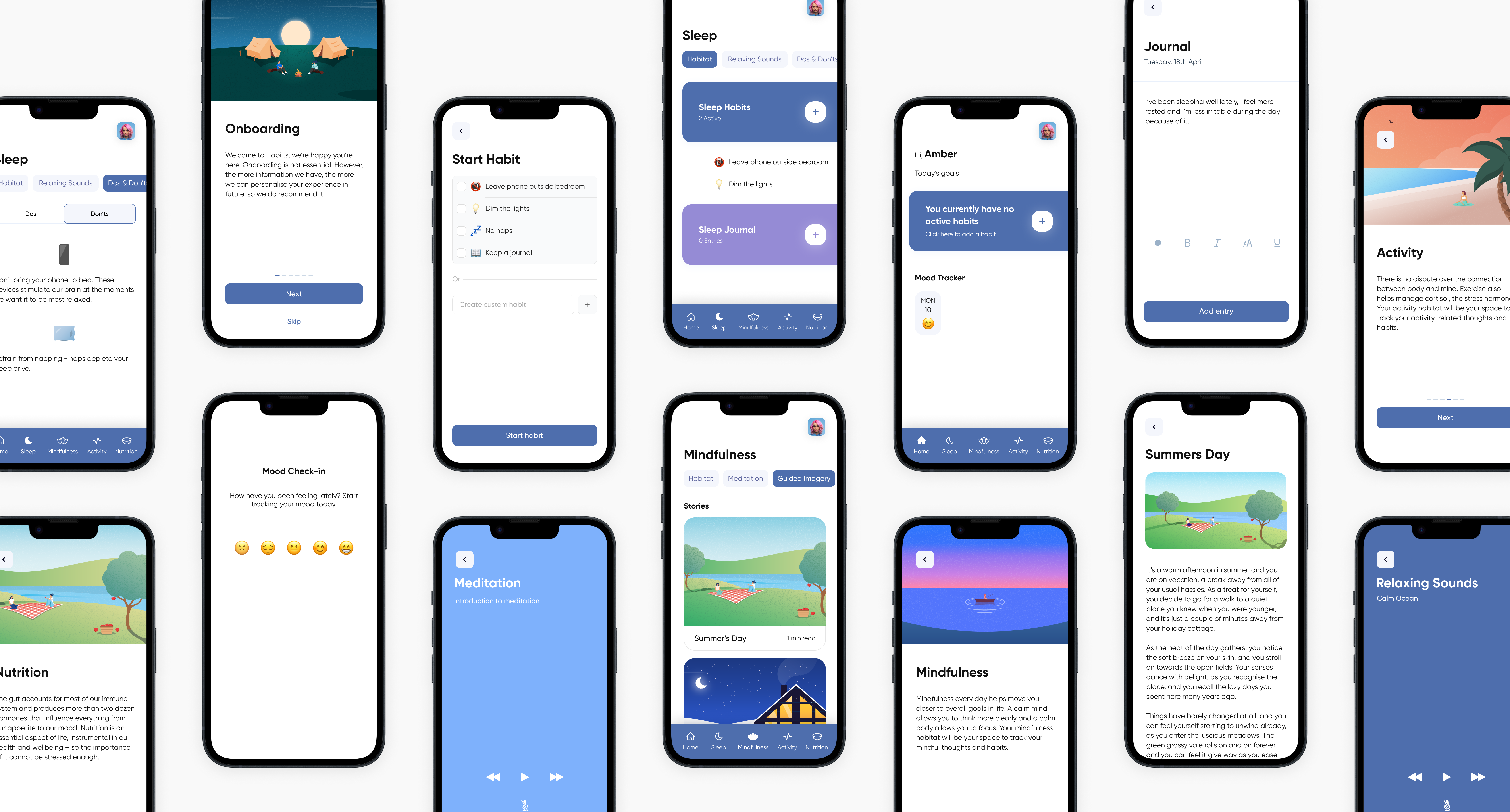
I conducted two rounds of usability testing using the System Usability Scale (SUS) to quantify user feedback. In the first round, users struggled to locate the “Add Habit” feature — which was a critical part of the experience.
Since this feature was the core action of the app, I needed it to be easier to discover and more intuitive to use. Over several UI iterations, I refined its positioning, labelling, and interaction model to reduce friction and improve clarity.
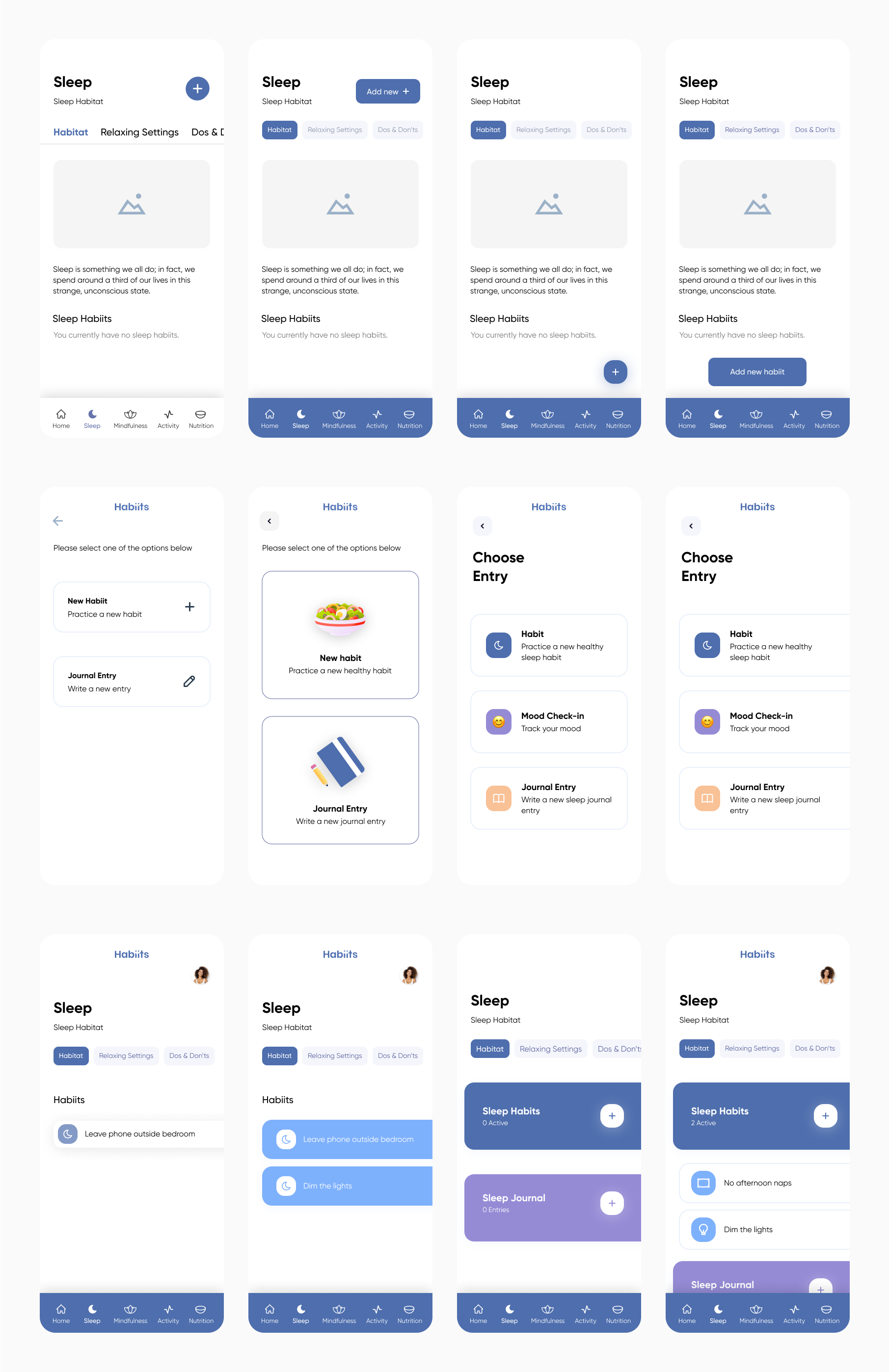
Through that process, I developed a set of unconventional, abstract UI shapes that protruded beyond the screen edge. These elements were both functional and expressive — acting as bold, tap-friendly entry points while reinforcing the app’s visual identity. They also doubled as status indicators, highlighting active habits in a clear and accessible way.
Most importantly, placing the trigger for “Add Habit” directly inside the same visual container as the section title (e.g. “Sleep Habits”) created a much stronger visual grouping — making the action harder to miss. Confident in these refinements, I moved into a second round of testing to validate the improvements.
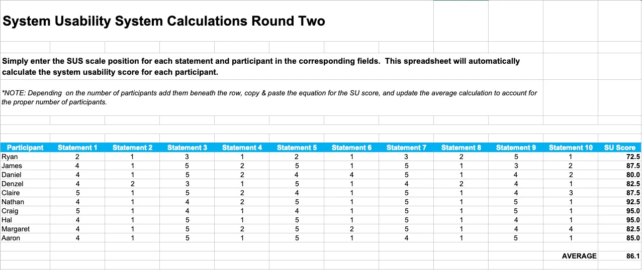
By the end of the second round of usability testing, SUS scores had significantly improved, confirming that the interaction refinements — particularly around the “Add Habit” feature — were effective. Users found the experience more intuitive, visually engaging, and easier to navigate. These results validated the value of iterative design and gave me confidence that the core experience was both functional and enjoyable. With the design validated, I felt confident in what Habiits had become.
Outcome
Habiits became a vibrant, user-friendly app that encourages healthy habits through intuitive UI, positive reinforcement, and minimal friction. The final design promotes self-reflection, progress tracking, and habit-building through simple, engaging interactions.
Reflection
This project pushed me beyond just UX and UI. I tackled illustration, animation, and large-scale, complex prototyping — areas I had little experience in beforehand. Creating a consistent visual language, managing 700+ screens, and working around technical limitations like audio integration challenged me in new ways. But each hurdle became a learning opportunity, and I finished the project with a broader, more well-rounded skillset.
While it was challenging at times, it was also one of the most rewarding projects I’ve worked on.
What I Learned
This project sharpened my skills in UX research, flow design, and iteration — but more importantly, it reinforced the value of staying open to change. The idea I started with evolved directly from user insights, and that flexibility led to a stronger, more relevant solution.
Working on Habiits deepened my passion for designing thoughtful, human-centred experiences — especially in the mental health space. If I revisited the app, I’d love to explore motion and microinteractions further to enhance user feedback and engagement.